9 Lessons on Data Products

“Why don’t my customers use their reporting dashboard?” This question is so common it is a cliche.

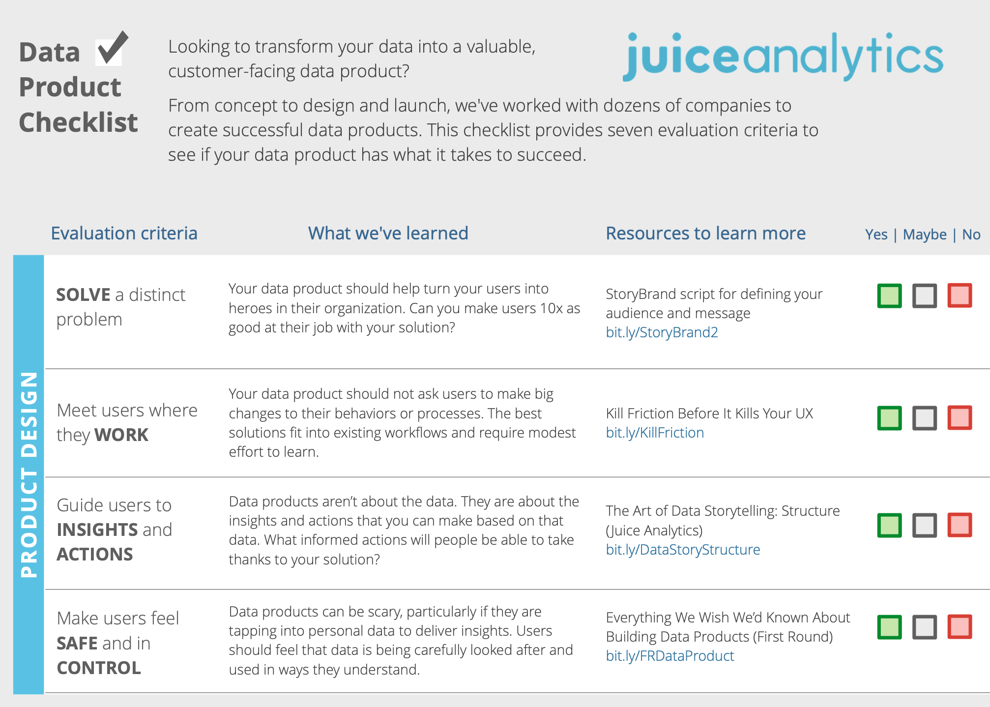
Frequently the answer is that the customer-facing dashboard was not treated like a product. Basic questions were missed in the rush to make the data available: What are my users pain points? How do we make their life better?

The essential elements to a good data product aren’t a huge mystery. But they do take an empathetic, customer-focused perspective that is often lacking. I’ve been involved with designing and launching dozens of data products. Here are some of my key lessons:

The Right Mentality

Lesson 1: Apps, not Dashboards. Multiple, small, focused data products are better than one comprehensive solution that tries to do too much. Many companies launch an “analytics dashboard” or “self-service portal” that is design to answer any and all questions. Of course it doesn’t, and is more confusing than useful. Attempting to serve everyone serves no one.

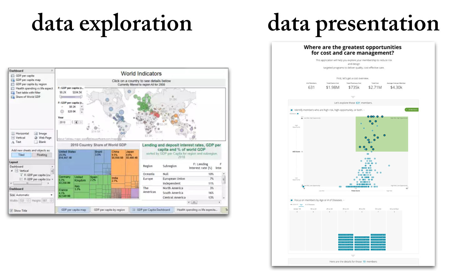
Lesson 2: Form Follows Function: A data product should be delivered and experienced by different audiences in different ways. For example, an executive audience is more interested in summarized insights delivered in static formats (PDF, PPT). Whereas analytical audiences may want an interactive, exploratory solution. And don’t forget the front-line decision makers who may need contextually-relevant, real-time data on their phone.

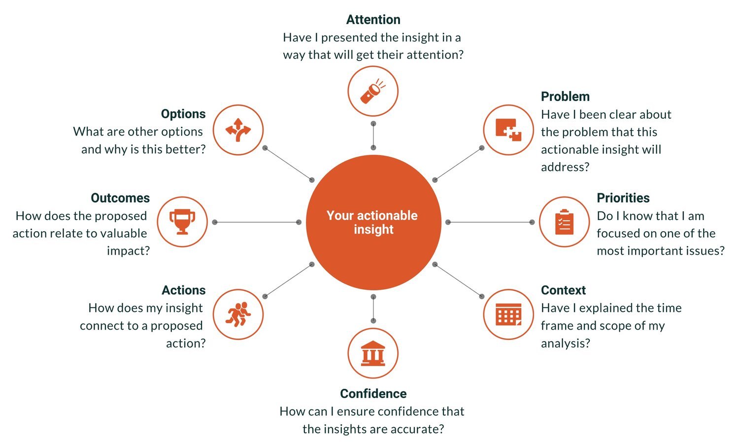
Lesson 3: The Goal is Insights. To paraphrase James Carville, “It’s the Insights, Stupid!” The data, visualizations, dashboard…these are all vehicles to find and deliver useful insights. How are you guiding people to find insights, then share and act on those insights?

User Experience

Lesson 4: Lead with Actions. For many years, we designed analytical solutions that assumed users will drill into the data to find the information that was most relevant to them in the moment. It isn’t always the right starting point. If possible, lead with the To Dos or Actions. Avoid making your users to any extra work.

Lesson 5: The Right Starting Points. Initial settings and personalization are powerful tools in your design toolbox. A remarkable number of data product users (we’ve watched a lot videos of user behavior) will not click on anything to customize the views of the data. Give them the default selections that deliver the most relevant information.

Lesson 6: Data Wrapped in Context. A data product needs to do much more than present data. It needs to explain the scope and purpose of the solution, guide the users through the experience, and provide help. More than most, our solutions use images and text to put the data in context. Your users won’t appreciate the value in the data if they are drowning in the deep end.

Lesson 7: Secondary Audiences. Data product serve more than the direct users. The information in your product needs to travel to secondary audiences who may impact decisions. How can you ensure insights can get shared more broadly, making your users into heroes in their organization?

Product Launch

Lesson 8: Selling is Priority #1. This is comfortable territory for many data people. However, as creators of data products, we need to think about how to support the sales team, clarify the value points for customers, and deliver a premium, differentiated product. None of your hard work or data insights matter if customers don’t choose to buy it.

Lesson 9: Iterate on Feedback. A data product should be its least-good version on initial release. As you start to get (paying) customer feedback, you’ll learn more about what customers really want. You want to be positioned to quickly iterate and improve your product when this valuable input comes in.

The Unfinished (Data) Story

Once there was a data visualization professional who worried that translating data into intuitive visuals wasn’t enough to make him relevant. Too often, the villagers gave him slyly-condescending compliments like: “We love how you make data pretty.”

The Data Visualizer sat on a tree stump deep in the woods and thought, How can I be more than a ‘drawer of pictures’? A picture was worth a thousand words…but the saying offers nothing about how those thousand words change how people think. Dispirited, his gaze wandered to a fallen apple nearby, his mind wandered to the story of Sir Isaac Newton’s discovery of gravity.

“Eureka!” he exclaimed, “when you tell a story, you shape a myth. And when you shape a myth, you transform how people think. I’ll be a storyteller. My charts will be data stories, and my presentations will have powerful narrative arcs.”

The Data Visualizer — reborn a Data Storyteller — leapt off the stump and raced down the wooded path in the direction of his laptop.

And so it was that data visualization became data storytelling, and everything and nothing changed.

Data Storytelling is the newest promised path to influence, impact, and relevance for people who communicate data. I’ve spent most of my career in this camp, and would humbly submit that I helped usher in this concept. As a group, we are driven by the best of intentions: to inject data-informed insights into discussion that may otherwise be guided by deeply-held assumptions, bias, and uninformed reactions. We see ourselves on the front-lines of the fight for rationality. Data Storytelling was our powerful new weapon in this good fight.

But like most new concepts and technologies, Data Storytelling quickly became overrun by expectations and misuse:

Google Trends tracks the growing popularity of “Data Storytelling” starting around 2017

A certain corner of the web became littered with posts like this: “The Power of Data Storytelling: Captivate Your Audience and Close More Deals”. I’m as guilty as any in pushing this concept.

A mentioned of Data Storytelling in r/analytics on Reddit led to this top-voted comment:

Data Storytelling surfaced in the Gartner Hype Cycle in 2022, sitting at the Peak of Inflated Expectations.

Meanwhile, it was built into the marketing language of every data and analytics company. Everyone was telling data stories. …or were they?

But little has changed. We are still awash in bad dashboards, too-long presentations, convoluted reports. It is time to take a more critical look at Data Storytelling to evaluate:

  1. WHY has data storytelling been more sizzling concept than a useful steak?

  2. HOW can we reframe Data Storytelling to make it a tool that more people can use?

I’ll save my thoughts on that for Chapter 2 of our Story, where our Data Storyteller turns “Data Hipster” (thanks, CY) and wonders what hath he wrought. For a preview of the “How”, I touched on topic early this year in a post about “Data Storytelling 2.0”.

Another Hot Data Trend — Same Timeless Goal

Every major company is now saying they have Generative AI and are doing AI. The hype battle is long underway, and the marketing avalanche is in flight.

Industry professionals know it’s merely the beginning of something much bigger that will take time to unfold; meanwhile, most of the market thinks it’s just another thing.

🗽 🇺🇸 🌭 Who's the greatest President? Who's greatness is most disputed?

525 historians and political science scholars got together and ranked all the Presidents. It sounds like the ultimate bar game for U.S. history professors. They releases their results recently here

As per usual, the report does no favors for the casual reader who might want to explore this data. So I put together an interactive app (open in a new window)

This is the beauty of Juicebox: if only one of those 500+ academics had asked, I could have given them a 10x better way to present their data before they released their PDF.

Battle of the Chatbots!

Which Chatbot is the best? Check out our interactive app below:

🤖 Which organizations are taking the lead with their Chatbot models?
🤖 How are Chatbots improving over time?
🤖 Which University has created a top 5 Chatbot?

The data is sourced from the Large Model Systems Leaderboard (https://lnkd.in/gvDSKSN9), "a crowdsourced open platform for LLM evals. We've collected over 200,000 human preference votes to rank LLMs with the Elo ranking system."

The Irregular Path of Data Analysis

Change does not happen in straight line. And we do a disservice when we thinking about “data driven decisions” as a simple sequence of events:
gather data —> do analysis —> find insights —> present insights —> action

Let’s take a few examples from outside the world of analytics:

1. In 1969, a community of Native Americans protested on the island of Alcatraz in the San Francisco bay. For 19 months, they occupied the island, demanding the return of the land. In the end, the protest fizzled and their demands were reject. However, their efforts were not ultimately without change. In the following years, President Nixon signed a series of bill to give back millions of acres of land to Native Americans and provide support for their communities.

2. Marketing professionals have had to embraced the messy, complex reality of multi-channel and multi-touch marketing. It recognizes that purchasing decisions aren’t a one-and-done conversion event. In fact, it can take 8 or 15 touches of a consumer to get to a purchase decision. That makes marketing more like a series of nudges than a single convincing argument.
Action comes about through a circuitous route.

Analytics professionals need to internalize this same lesson. It can change how you think about your role:
* Persistence in sharing your message > Perfection of message
* Many insightful nudges > A single comprehensive presentation
* Building relationships with your audience > Unassailable logic

Data Storytelling 2.0

I've been writing about data storytelling for a decade. The concept has grown in popularity; the underlying concepts haven't changed much.

Most courses or books will emphasize the same core concepts: focus on your audience, set up the conflict, lead your reader to resolution and action, use visualizations to deliver your messages.

These are good things if you want to convey a message with data. But if we were to put Data Storytelling on the Gartner hype curve, it would sit somewhere beyond the "Peak of Inflated Expectations" and far short of the "Plateau of Productivity." People love Data Storytelling as a concept. They struggle to make it useful in their everyday work-life.

I think it is time to reconsider and reframe Data Storytelling to make it a useful tool in our modern workplace. A few examples:

Data Storytelling v1.0 --> 🆕 Data Storytelling 2.0

One-directional presentation to an attentive audience --> 🆕 Bi-directional dialogue to an attention-starved audience

The capstone to an analytics journey --> 🆕 A set of techniques used at every stage of the journey

Visuals and language will carry the message --> 🆕 Delivering to an audience must consider Where, When, Channels, Formats.

Comprehensive narratives --> 🆕 Insights as the essential unit of communication

Target your audience --> 🆕 ...and the people your audience will share it with

Data storytellers need a collection of skills --> 🆕 Specific data storytelling skills can be applied selectively by many people

How to Summarize Data using ChatGPT

We know that ChatGPT is remarkable at generating text. It is also a powerful tool for summarizing text. It can compress a long article down to the CliffsNotes version in an instant.

How does it do with data? With some prompting guidance, I was able to teach ChatGPT an approach for summarizing a data table. Understanding what you are working with in data is often the first step before diving into analysis. I was impressed with the results once I walked ChatGPT through my general thought process.

I started with this prompt:

Step 1. Describe what each row in the data set represents.

Knowing what you are working in a data set starts at the row level. I found ChatGPT was exceptional at identifying the meaning of the individual rows in my tests. For example:

Step 2. Change the data field labels to make them more human readable, use proper capitalization, expand out abbreviations, and remove non-alphabet and non-numeric characters.

Many data files arrive with column names written by DBAs that are hard to decipher. Take this collection of data fields:

  • FTResTuition

  • PTResTuition

  • FTNonResTuition

  • PTNonResTuition

If you are familiar with the data, these names may be obvious. Fortunately ChatGPT is able to turn those into:

  • Full-time Resident Tuition

  • Part-time Resident Tuition

  • Full-time Non-Resident Tuition

  • Part-time Non-Resident Tuition

Step 3. Group the data fields by topic or other logical grouping. For each data field, identify if it is a metric, dimension, boolean, or date.

Finding similar concepts is another Large Language Model strength. When you are dealing with data tables with dozens of columns, it can be helpful to understand how those data fields fit together. Equally impressive is the ability for ChatGPT to understand different data types.

Step 4. For each metric data field, show the highest and lowest value in parentheses. For each date field, show the earliest and latest date in parentheses. For each dimension, show the most frequently occurring value in parentheses

It can be really helpful to get a sense of your data by seeing the range of values and common values.

Step 5. Identify any data fields that have many null or empty values. Label these data fields as "null or empty”. Also, identify any data fields that have all the same value. Describe these data fields as "uninteresting"

Finally, data tables with lots of columns often have a lot of cruft — the blank or poorly populated fields that are better to push aside as you thinking about where you want to focus.

After defining all these steps, I played around with how I wanted it to render the results. I ultimately decided to consolidate steps 2 through 4, and suppress ChatGPT’s inclination to be verbose about the instructions. Here’s the final prompt that I landed on:

I want you to use the following Data Summarization process on a data set:

Step 1. Describe what each row in the data set represents

Step 2. Change the data field labels to make them more human readable, use proper capitalization, expand out abbreviations, and remove non-alphabet and non-numeric characters. Group the data fields by topic or other logical grouping. For each data field, identify if it is a metric, dimension, boolean, or date. For each metric data field, show the highest and lowest value in parentheses. For each date field, show the earliest and latest date in parentheses. For each dimension, show the most frequently occurring value in parentheses

Step 3. Identify any data fields that have many null or empty values. Label these data fields as "null or empty”. Also, identify any data fields that have all the same value. Describe these data fields as "uninteresting"

When you show the results, you can write the Step number but don’t need to include the step description. Are you ready for some data?

After pasting that full prompt into the chat window, I simply copy and pasted a chunk of data from Excel to get a result that looks like this:


Celebrating Women in Data Visualization & Storytelling

March is Women’s History Month, and we have been celebrating all month long on social media and as an organization! We wouldn’t be the same company and our industry wouldn’t be what it is without the amazing women in each! We wanted to take some time at the end of the month to celebrate female pioneers and influential women in data visualization and storytelling!

Florence Nightingale:

Florence Nightingale is considered to be one of the first pioneers of data visualization. While she’s best known for her advancements in nursing, she also is credited with being one of the most influential early figures to not just use data, but to show it in a way that could impact and move her readers - who were ordinary people and even Queen Victoria herself. Nightingale was known for her love of statistics. And during her time working in a military hospital, she helped to prove that hygiene and cleanliness of the hospitals were directly linked to soldier deaths in combat. She used her experience in nursing and love of statistics to take data and information that were collected and turn it into charts and graphs like the one below. However, because she was a woman in the 1800s, she isn’t adequately credited for her advances of data visualizations along with the “founding fathers" we are more familiar with.

Lea Pica:

Lea Pica is known worldwide as a data presentation guru, or as she describes herself, “Let me be your Slide Sherpa. Your Viz Vizier. Your guide on the exciting road to presentation enlightenment.” Pica used her experience in musical theatre to bring a “performance” aspect to her professional career. But try as she might, she realized that even all of the bells and whistles she thought would help her successfuly grab attention, were falling flat. She became a self-taught visualization expert and now, she’s among the ‘leading ladies’ of the data visualization and presentation world!

Amanda Cox:

Amanda Cox is an America journalist and data visualization that is well-known for her work as the data designer at the New York Times where she rose to serve as editor of The Upshot section. She worked as a graphics editor from 2005 through 2016 at the NYT. And her desk created the infamous election monitoring needle we see from the NYT every election cycle since 2016.

Cox is known as the “Michael Phelps of infographics,” a title we are quite fond of! In her opening statement of her keynote at the OpenVis Conference in 2013 she popularly said that ultimately design isn’t about typography or whitespace, but rather empathy - it’s about creating visualizations that readers can both understand and connect to emotionally. Since Cox's tenure, the Times has "led the field of innovative information graphics" and "raised the bar of journalistic interactive visualization."

She has also served as the judge for data visualization competitions, and several of her data visualizations were selected for The Best American Infographics 2014 and The Best American Infographics 2016. It’s easy to see why we would include her in this list of influential women who are cemented into the history of women in data visualization.

Emma Willard:

Emma Willard is probably best known for her visually-stunning maps, and being America’s first female map maker. Her Temple of Time visualization is one that she hand shaded and details the timeline of world history. She used a flow diagram to showcase the rise and fall of empires throughout history. Willard described her reasoning for this visualization in this way, “By putting the course of time into perspective, the disconnected parts of a vast subject are united into one, and comprehended at a glance;–the poetic idea of “the vista of departed years” is made an object of sight; and when the eye is the medium, the picture will, by frequent inspection, be formed within, and forever remain, wrought into the living texture of the mind.

Creating an Alternative Law School Rankings Report

The The New York Times recently published a story: “Defending Its Rankings, U.S. News Takes Aim at Top Law Schools” (paywalled) about how Law Schools are fed up with the US News & World Report rankings, and how the magazine is fighting back. I was particularly struck by this passage:

Ms. Gerken, the Yale Law School dean, and other participants suggested that the data gathered by the American Bar Association already provided good information for prospective applicants. The data provided on the bar association website, however, does not allow someone to easily compare one law school with another, and it lacks the emotional punch of number rankings like the one used by U.S. News.

Another sad case of good data stuck in bad formats like Excel downloads and antiquated interfaces. Fortunately, it is a problem that is very fixable with Juicebox.

We created an alternative Law School Comparison site using data from American Bar Association and AccessLex Institute. With this type of interactive report, we think about a few key things:

  • How do we provide interactivity so the user can make the results most relevant to their needs?

  • How do we give users a workflow through the data to support their exploration?

  • How can we guide and narrate this journey with good descriptions, labels, and visual indicators?

When Law Schools and American Bar Association are ready to break free of the tyranny of US News & World Report (but still recognize that data transparency is important for decision-making) they know who to call. Check it out 👇