
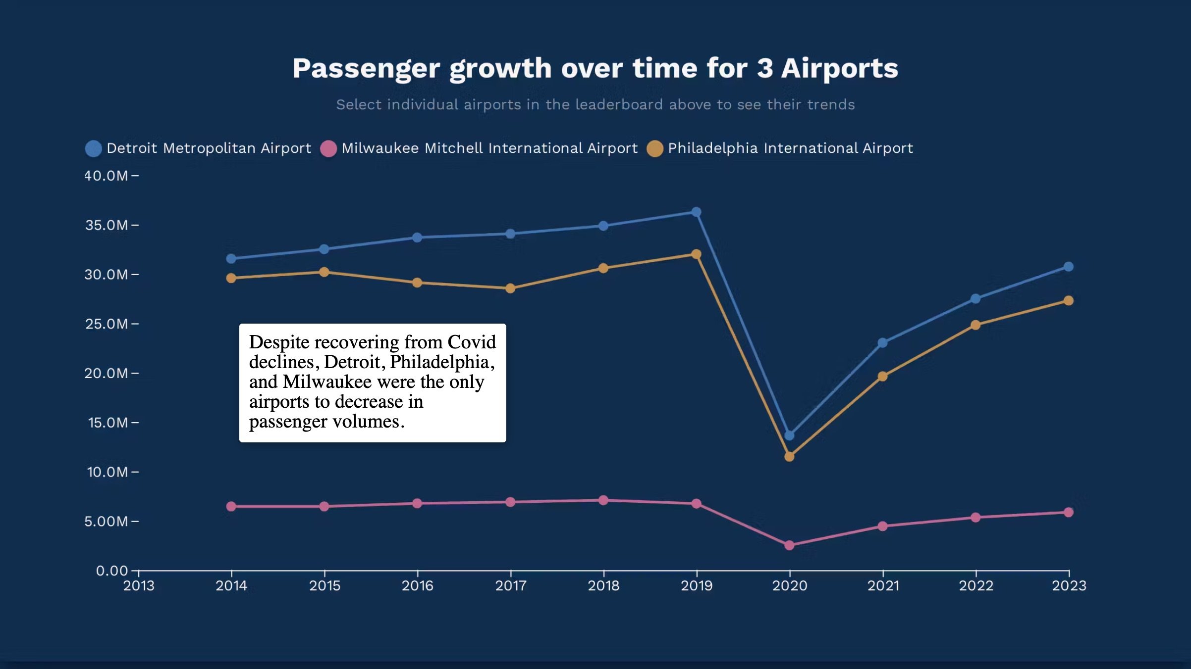
Insights into Airport Traffic
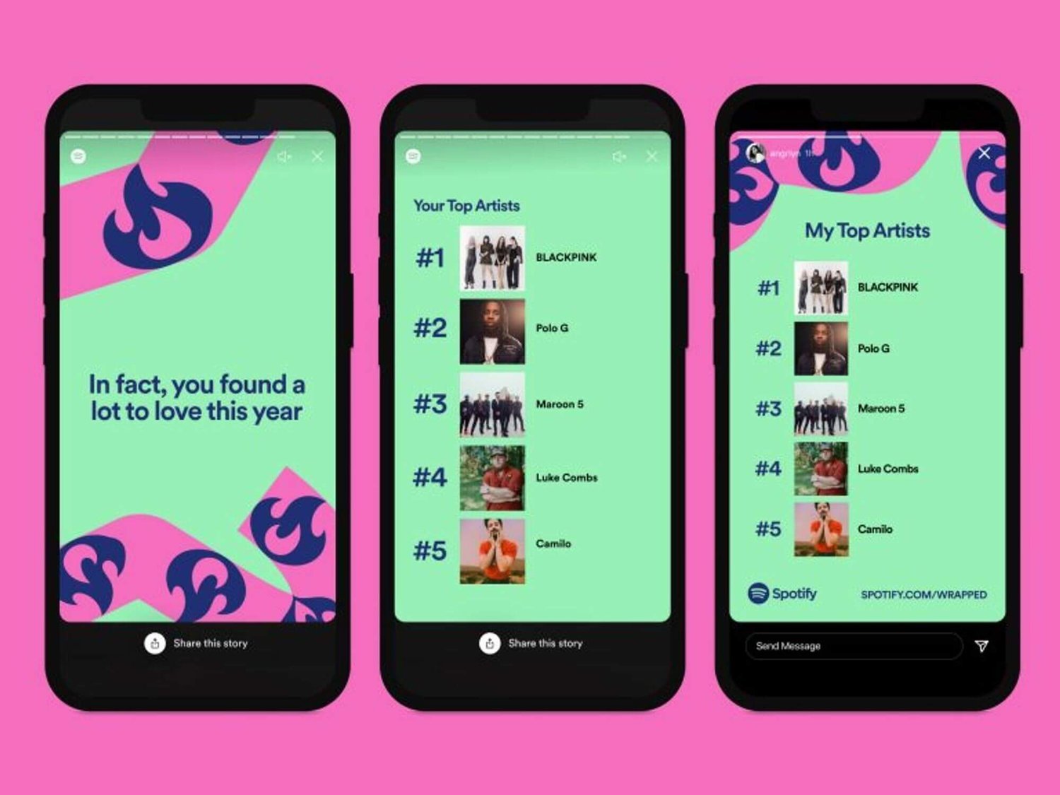
Teaching Data in the Classroom with Interactive Storytelling
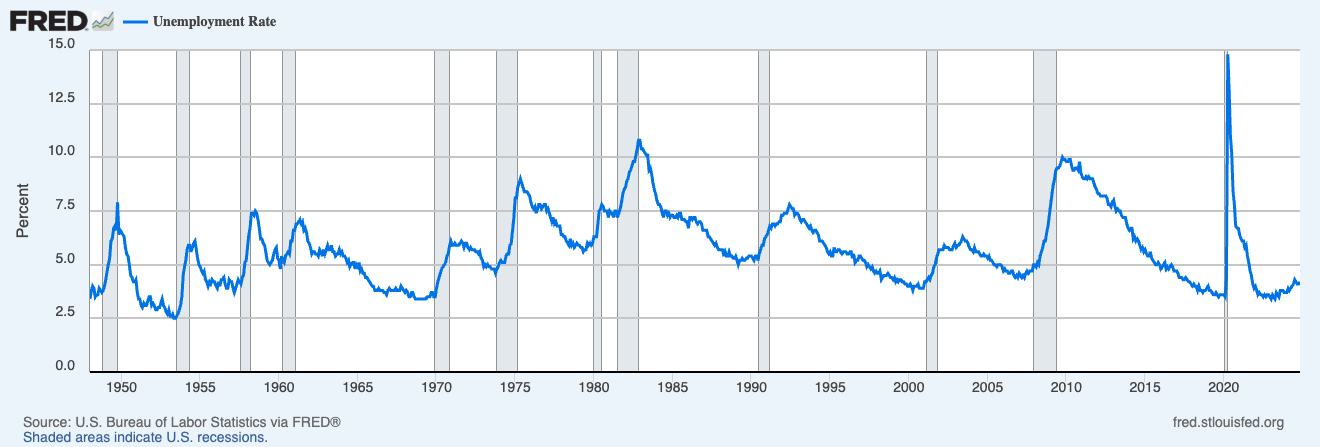
What Does FRED Teach Us about Successful Data Products?
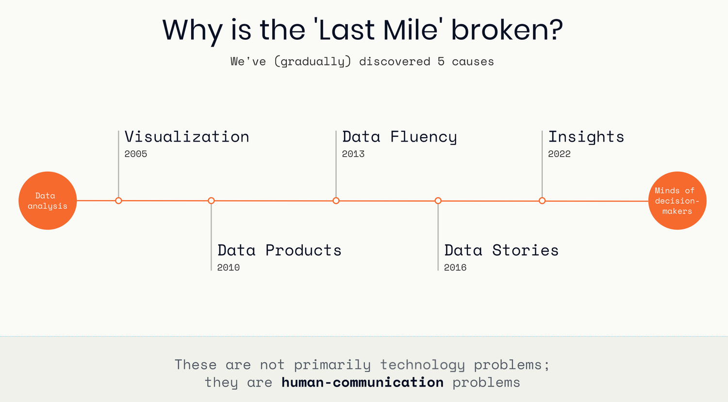
The Last Mile of Data

Holiday Gift Guide for Data Nerds
What a Surprise! Data Storytelling has been alive, and real, all along
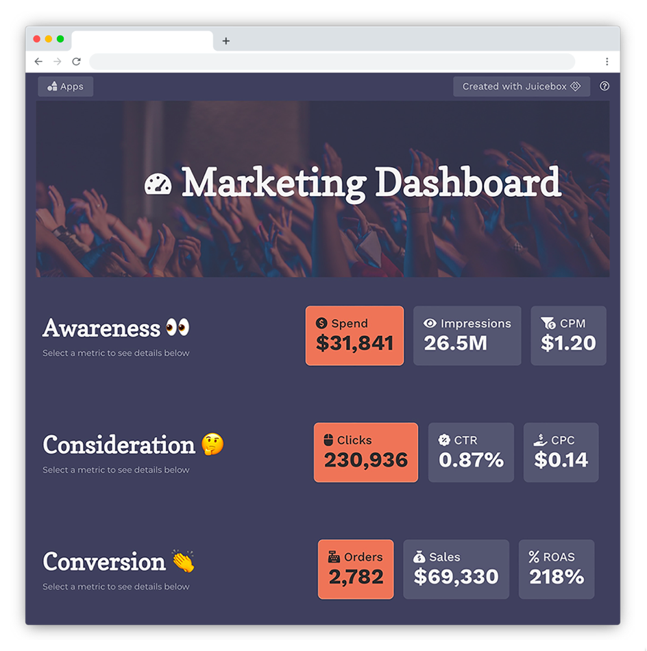
How to Apply Data Storytelling to Dashboards
How Data Storytelling Can Build Better Customer Connections
How to make your data insight land with your audience
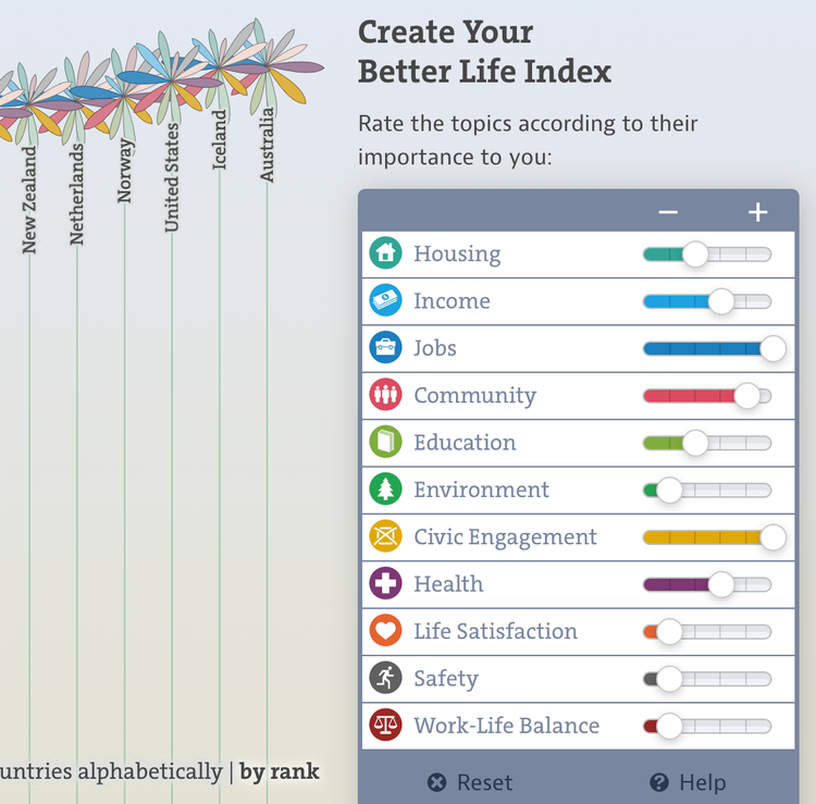
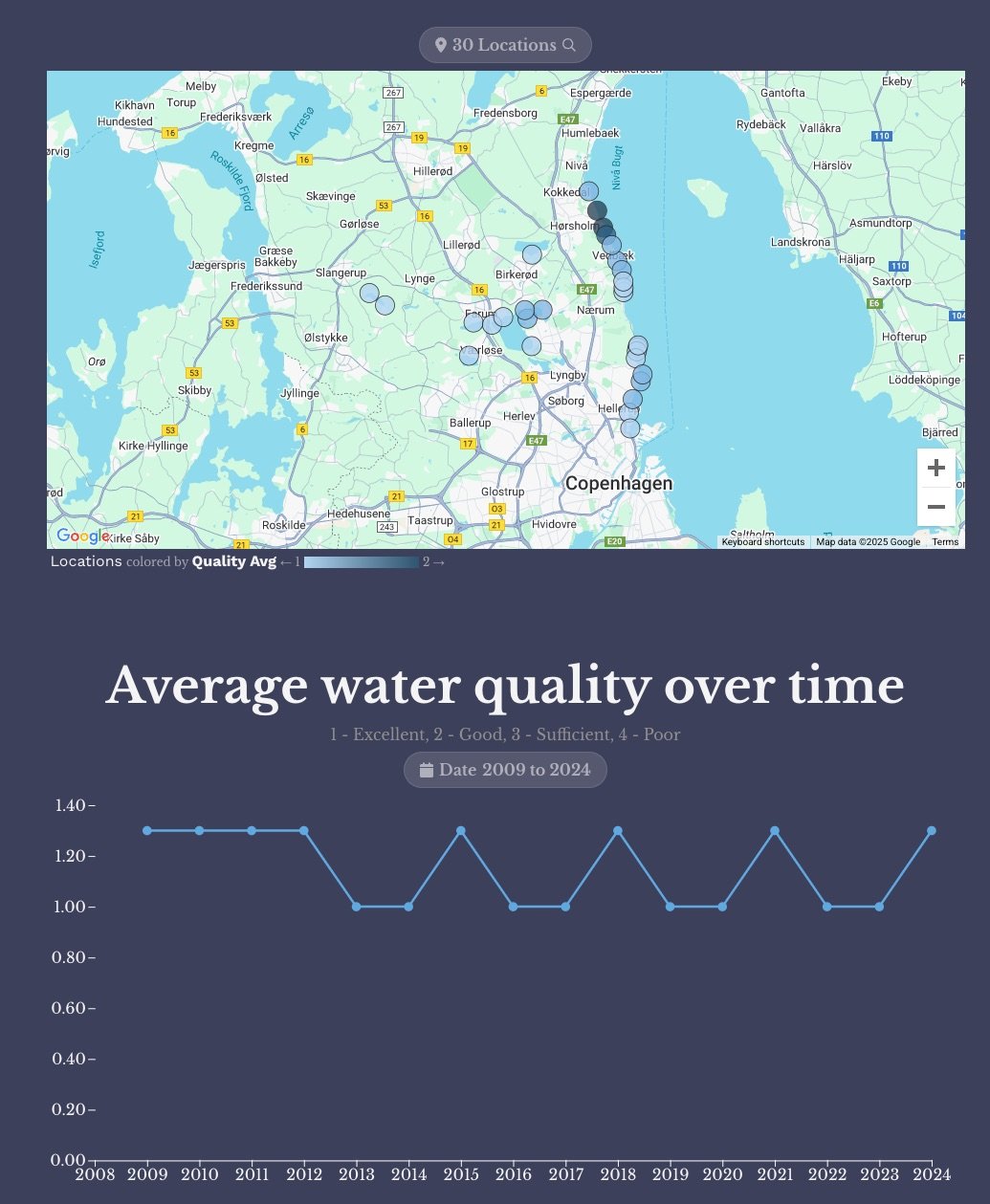
A 12-Point Checklist for Public and Open Data Sites (with Examples)
The Delight of Data Insight
Use Specific Examples to Enhance Your Data Story
Data Insights, The Next Step in the Last Mile of Analytics
Battle of the Chatbots!
🤖 Which organizations are taking the lead with their Chatbot models?
🤖 How are Chatbots improving over time?
🤖 Which University has created a top 5 Chatbot?

The Irregular Path of Data Analysis
Change does not happen in straight line. And we do a disservice when we thinking about “data driven decisions” as a simple sequence of events:
gather data —> do analysis —> find insights —> present insights —> action
How to Summarize Data using ChatGPT
We know that ChatGPT is remarkable at generating text. It is also a powerful tool for summarizing text. It can compress a long article down to the CliffsNotes version in an instant.
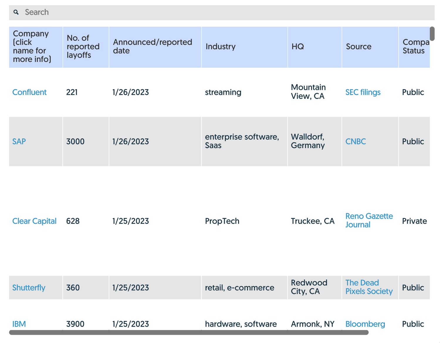
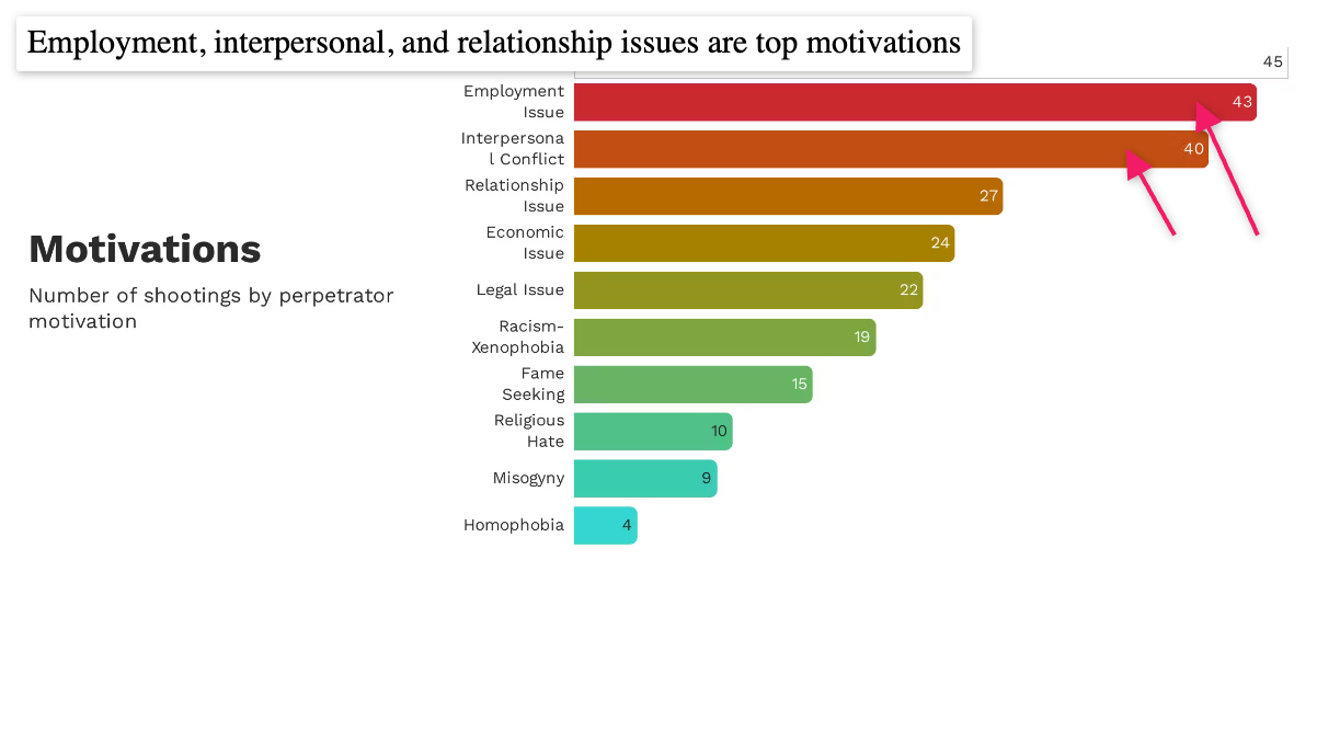
Tech Layoffs, Visualized
There’s obviously a lot of value hidden in this data, so we pointed Juicebox at it to discover (and share) some of those hidden insights. The interactive report we built is embedded below, but here are some things we captured during our exploration:
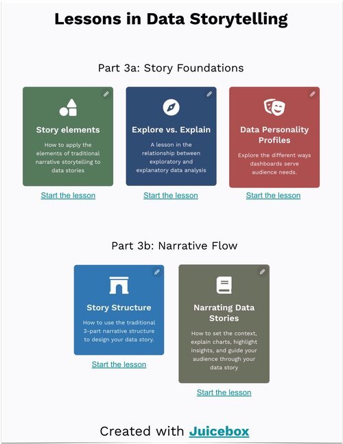
23 Best Data Storytelling Courses, Workshops, and Free Resources
Are you looking to upgrade your Data Storytelling skills? There are many options for learning. We’ve compiled an updated list of resources, including free training, online courses, and workshops from top experts. If you just want to get a sense of what makes a good data story, you can start with our list of the best data storytelling examples.
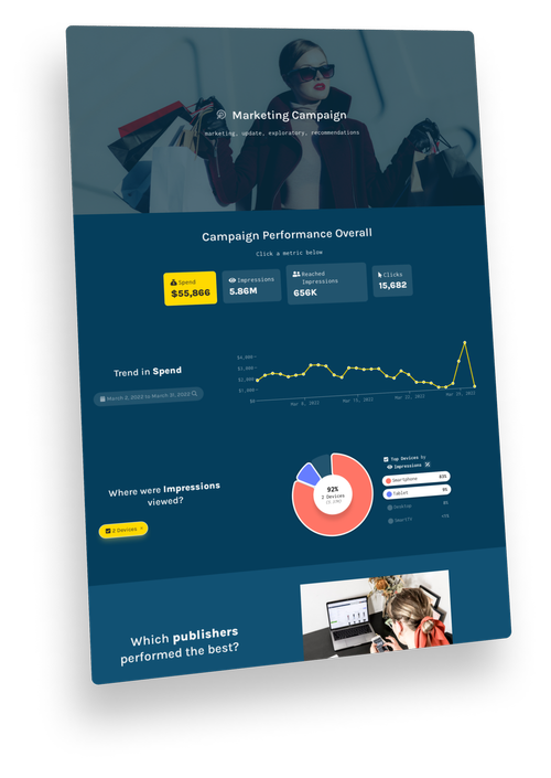
15 Best Data Storytelling Tools
Data storytelling is quickly becoming a popular mode for presenting data. It combines text and graphics with data visualizations to guide an audience. Traditionally, people have used tools like PowerPoint and Excel, as well as traditional dashboard and business intelligence platforms, to communicate in this way. But these solutions are limited in their ability to balance the explanatory and exploratory elements of an effective data story.
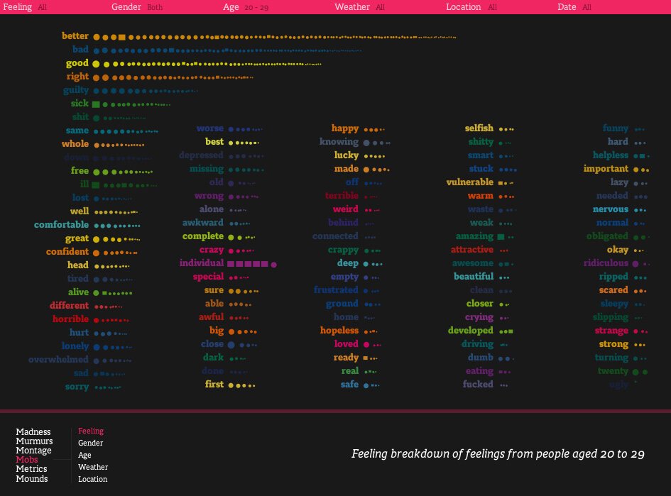
20 Best Storytelling Examples
This collection of world-class data stories demonstrates how to combine data visualization, interactivity, and classic storytelling. Each of these examples shows the importance of a clear message, supporting data and analysis, and a narrative flow to engage the reader.