
A Hierarchy of Needs to Live Your Best #DataLife
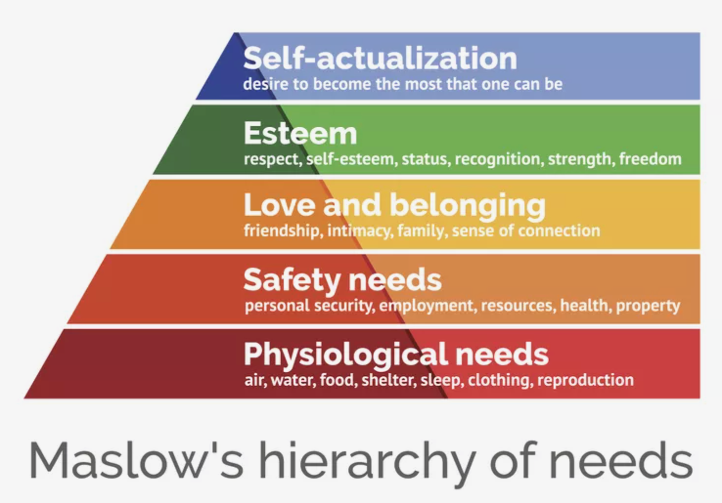
Maslow’s Hierarchy of Human Needs provides a useful framework for understanding the drivers of behaviors. He recognized that basic needs must be met before higher level functions can happen. He also identified that once a need is met, it becomes an expectation.
Celebrating Women in Data Visualization
A Better Pie Chart
I used to spend a fair amount of time criticizing pie charts. And I wasn’t alone — everyone who cares about visualizations has spent time shaking their fists at ineffectual pie charts (take this article for example: “The Worst Chart in the World”).
Data Storytelling: The Ultimate Collection of Resources
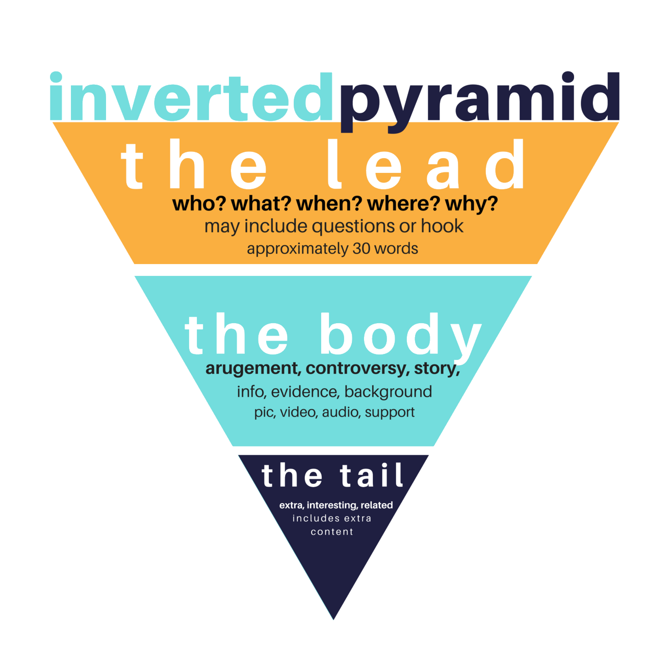
Data Storytelling is the evolution beyond data visualizations. It is a recognition that well-designed charts aren’t enough to move people to action. We need to use the tools and techniques of narrative stories to engage audiences with data. While the term has been around for a while, we are still early in the discussion about what Data Storytelling means and how it should be practiced.
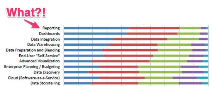
Reporting: The Most Boring, Important Thing in Analytics
How to Build Stronger Connections through Customer Reporting
Customer reporting is one of the most under-appreciated touch-points that service and solution companies have. Whether it is a weekly status update or a performance dashboard, reporting can be an opportunity to demonstrate expertise and value.
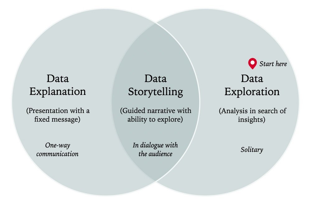
Exploratory vs. Explanatory: The Difference Between Data Analysis and Data Presentation

11 Data Presentation Tips and Resources to Deliver More Client Value
Getting Started with Data Storytelling
How to get started with data storytelling? For the beginner — and even for the experienced data analyst or data scientist — data storytelling can be a vague, disorientating concept.
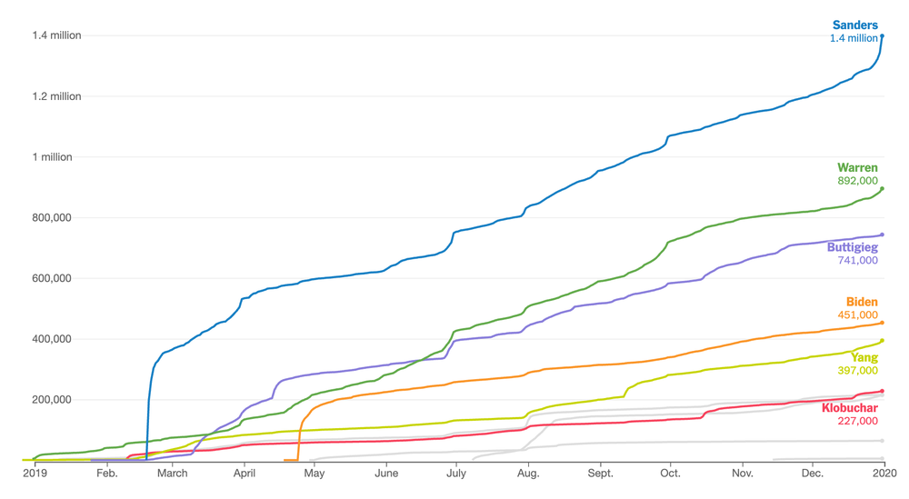
20 Best Examples of Charts and Graphs
We’ve collected these high-quality examples of charts and graphs to help you learn from the best. For each example, we point out some of the smart design decisions that make them effective in communicating the data.

11 Examples of Good & Bad Data Storytelling
With the popularity of our list of 20 Best Data Storytelling Examples, we thought it worth finding some more data stories for inspiration. The good examples in this list demonstrate how to combined data visualization, interactivity, and classic storytelling. They show the importance of a clear message, supporting data and analysis, and a narrative flow to engage the reader.
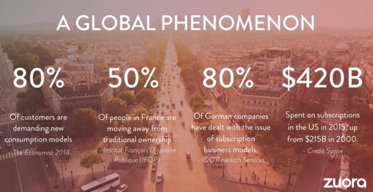
The Unexpected Value of Data Storytelling in Sales Presentations
Andy Raskin calls the following Zuora presentation “the greatest sales deck I’ve ever seen.”
Why’s it so great? It explains how a changing world will lead to winners and losers, and gives the customer a tease of how they can become a winner with the magic of the product.
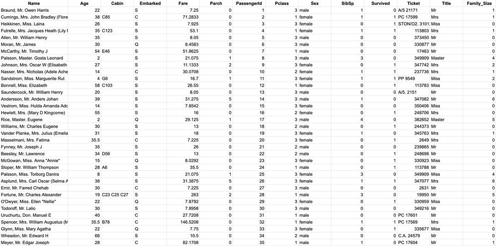
The How-To Guide for Cleaning and Preparing Data for Analysis
Tidying up your data is part science, part art, and all work. If you’re lucky, you’ll get your hands on some perfectly formatting data (Slack does a nice job, for example). But more often than not, you’ll need to do some data cleaning before it is ready for analysis. Survey data is a particularly common clean-up challenge, but even pulling data from Google Analytics will require some clean-up.
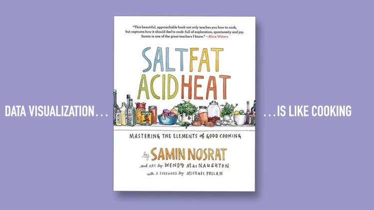
Are You Cooking or Baking with Data?
Cooking is one of my favorite go-to analogies for data storytelling and data visualization. There is much in common when you think about the process of transforming raw ingredients into a finished product. Let us count the ways…

Tips for Using Photos in Data Storytelling
Data storytelling needs more than a collection of data visualizations. It is about weaving an engaging message that combines data exploration with narrative, descriptions, and graphics. Photographs, in particular, can play a vital role to help your data story grab attention and provide emotional engagement.

Data Storytelling: What's Easy and What's Hard
Putting data on a screen is easy. Making it meaningful is so much harder. Gathering a collection of visualizations and calling it a data story is easy (and inaccurate). Making data-driven narrative that influences people...hard.
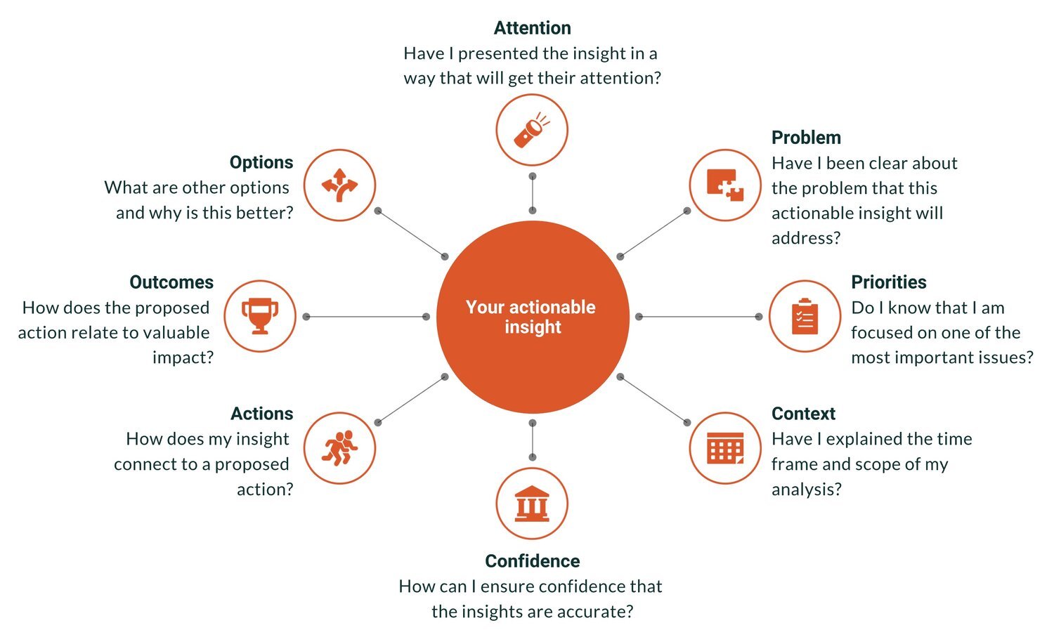
How to Ensure Your Actionable Insights Lead to Action
“Actionable insights” is the Holy Grail of analytics. It is the point at which data achieves value, when smarter decisions are made, and when the hard work of the analytics team pays off. Actionable insights can also be elusive — a perfectly brilliant insight gets ignored or a comprehensive report gathers dusts on a shelf.
7 Must-Have Data Visualization Skills for Data Analysts
When I speak to people new to the analytics field, they often wonder what skills will make them successful in their career. For all the data science skills, tools, and boot camps that are available, I still find that the missing link for many data analysts is the ability to communicate and convince after they’ve analyzed data. All your hard work is wasted if it doesn’t spur someone to change.

The Art of Data Storytelling
Data Storytelling is a powerful way to present data in ways that influence your audience. It is a skill that combines elements of artistic expression and structured methods. In this article, we will start by learning from the mindset of a leading storytelling organization, Pixar. Then we will discuss how to structure data stories to guide your audience through data.

Data Discussion Lessons from Brad Pitt
Presumably, your data is not meant to distort, yet we can gather from this short scene some practical communication tips to improve data-informed discussions.