Data Storytelling

20 Best Data Storytelling Examples (Updated for 2023)

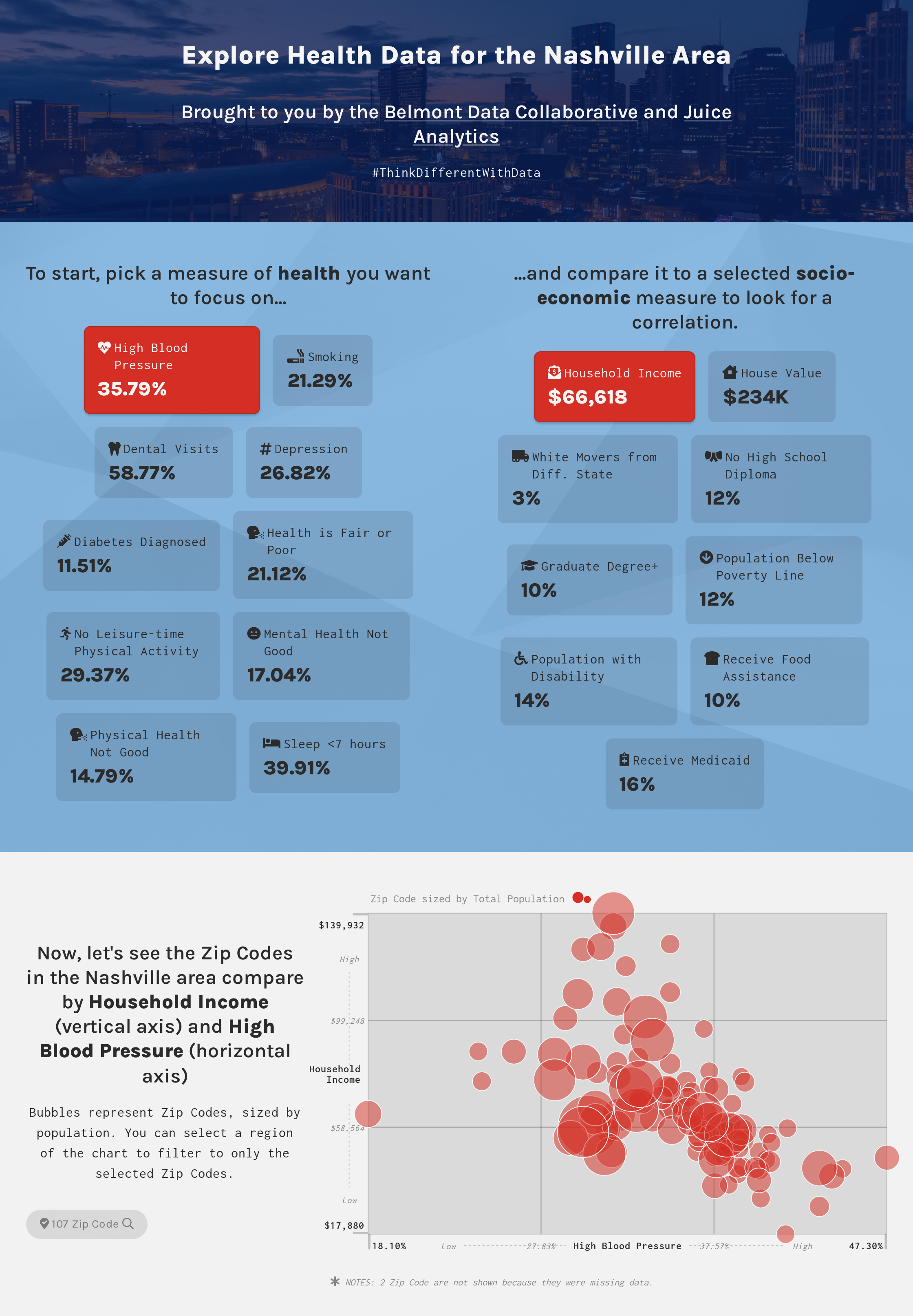
This collection of world-class data stories demonstrates how to combine data visualization, interactivity, and classic storytelling. Each of these examples shows the importance of a clear message, supporting data and analysis, and a narrative flow to engage the reader.

Want to learn more about data storytelling? We’ve compiled a grand collection of data storytelling learning resources. Or if you’re ready to build your own, try Juicebox.

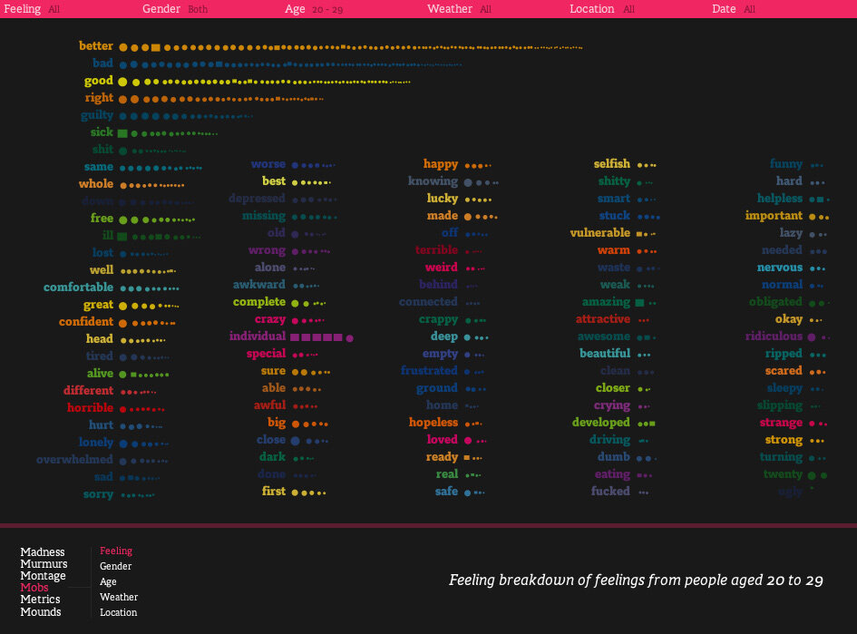
We Feel Fine by Jonathan Harris

“An interactive website…that searches the internet every 10 minutes for expressions of human emotion on blogs and then displays the results in several visually-rich dynamic representations.”

An extraordinary early data story (it runs in Java) that inspired a generation of data visualization professionals.

mobs-big.jpeg

Davis has created a beautifully-illustrated exploration of the different words used in literature to describe characters by gender.

The interactive website uses clever tactics to engage the reader — I particularly liked the quiz at the beginning. The combination of specific, personal examples and analytical research brings home the wide and discouraging discrepancies embedded in everything we read.

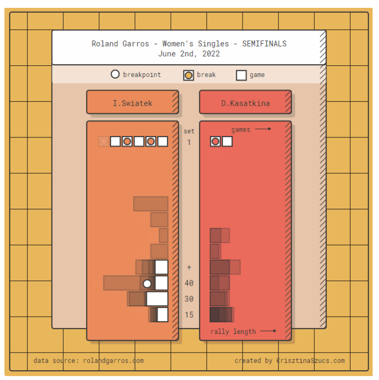
Animated Sport Results by Krisztina Szucs

More vignettes than stories, these brilliant animated visualizations show the progress of sporting events through a visual shorthand created by Szucs.

There are multiple visualization types for different scoring systems. Each one delivers a beauty and energy that better reflects the action of a game than a traditional box score — and displays information to help you understand the flow of the contest.

Buy or Rent by The Upshot

An interactive calculator that lets the user answer a basic and important financial question.

This tool is a classic demonstration of The New York Times’ design aesthetic, simple and direct user experience, and editorial clarity.

Is_It_Better_to_Rent_or_Buy__-_The_New_York_Times.jpg

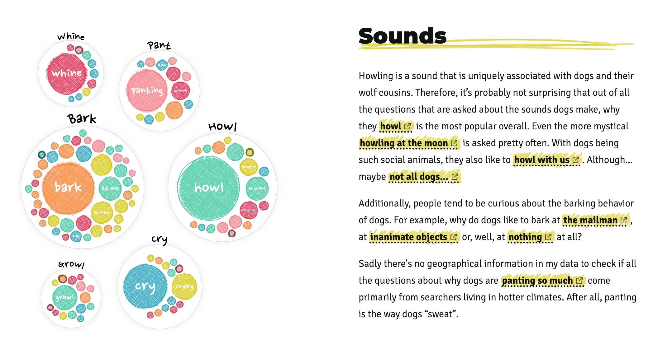
Why Do Cats and Dogs…? by Nadieh Bremer and Google Trends

A delightful romp through Google Trends search data about the behavior of dogs and cats. This data story combines guidance with customized exploration and beautiful visual design. Four Treats!

Why_do_dogs_____.jpg

Fry Universe by Chris Williams

It is time to tackle the eternal question: What is the best form of fried potato?

This light-hearted visual journey explains how the ratio of fried surface area to un-fried surface area can make for very different eating experiences.


Ready to create your own interactive data story? We’ve created the fastest path to beautiful data storytelling. Try it now!


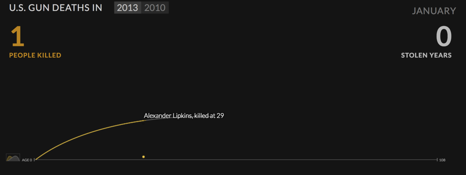
US Gun Deaths by Periscopic

This visualization shows “stolen years” due to gun deaths. It is a masterclass in connecting your audience with the emotional message by gradually revealing the data.

U_S__Gun_Deaths.jpg

Explorable Explanations by Bret Victor

User experience and information design guru Bret Victor delivers a meta-data story to show how to “enable and encourage truly active reading.” This work from 2011 was ahead of it’s time — as is most of Victor’s imaginative, inspirational work.

Bret_Victor__beast_of_burden.jpg

Cicadas, A Data Story by Kayla Brewer

We are taken on an educational journey about Cicada ‘Brood X’ and the emergence of these insect swarms (“small fly bois bring big noise”). Harvey demonstrates how creativity and a public data set can be transformed into an exploratory data story using Juicebox.

Cicadas_2021___Cicadas.jpg

“What 20,000 letters to an advice columnist tell us about what—and who—concerns us most.” This data story provides big picture views by topic and demographic integrated with specific examples that bring the data to life.

30_Years_of_American_Anxieties.jpg
 

Data Stories aren’t just for data journalists anymore. Create your own interactive, mobile-friendly, professionally-designed data story with Juicebox.


Redistricting as Mini Golf by The Washington Post

Not all data stories need to show a lot of data. This example leans on a fun, interactive premise to show how re-drawing districts (i.e. gerrymandering) can impact politics. By playing the game, you learn about the different political strategies and how contorted the districts can become.

“What does the loss of so many lives look like? Here are some ways to envision what 500,000 really means.” A powerful example of how to make your data relatable through comparison to familiar subjects.

Visualizing_500_000_deaths_from_COVID-19_in_the_U_S_.jpg

Can You Live on the Minimum Wage? by The New York Times

“This calculator shows the hard choices that have to be made living on the smallest paychecks.”

The simple beauty of this data story is in its ability to convey a message through user choices. It doesn’t take long to realize that the answer is “no.”

Opinion___Can_You_Live_on_the_Minimum_Wage__-_The_New_York_Times.jpg

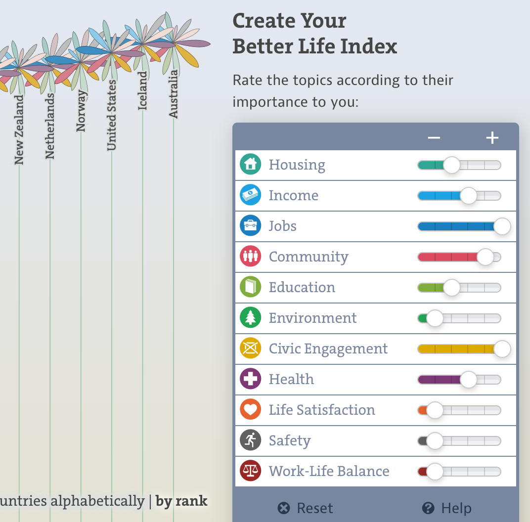
OECD Better Life Index by Moritz Stefaner

“This Index allows you to compare well-being across countries, based on 11 topics the OECD has identified as essential”

One of the all-time data visualization designs with clever choices for representing the data (‘blooming flowers’) along with flexibility for user control.

OECD_Better_Life_Index.jpg

“We have built a statistical model to estimate the odds of how each respondent will vote in next week’s mid-term elections.”

The Economist takes a complex voter model and makes it both easily accessible and fun to explore.

All_politics_is_identity_politics_-_How_to_forecast_an_American’s_vote___Graphic_detail___The_Economist.jpg

“Every year the top high school basketball recruits get hyped up. How often do they pan out?”

This data story teaches its readers a novel data visualization, then uses it again and again to show different angles on the data.

How_many_high_school_stars_make_it_in_the_NBA_.jpg

A Disappearing Planet by ProPublica

“Animal species are going extinct anywhere from 100 to 1,000 times the rates that would be expected under national conditions.”

This analytic explorational lets the user dive into the data all the way down to individual species.

A_Disappearing_Planet.jpg

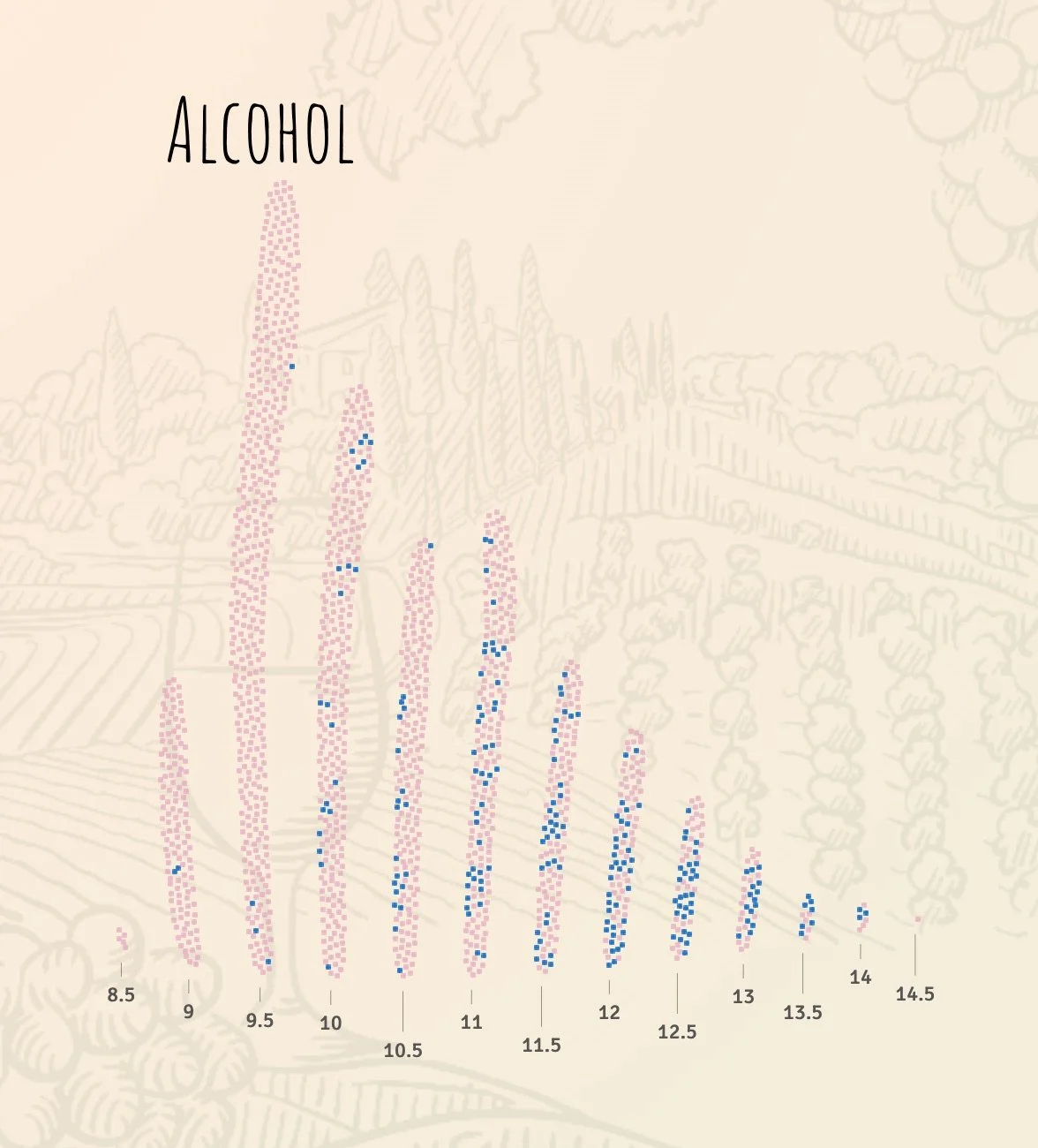
Wine & Math by The Pudding

A fun and engaging story that is a very palatable delivery mechanism for a statistical model to predict a wine’s quality by its properties.

This data story does an excellent job of setting the context and explaining predictive modeling before diving into the results.

FiveThirtyEight, known for its election coverage, shows how the Twitter followers of Democratic candidates overlap. The data story includes creative visualizations, another hallmark of this design team.

Which_2020_Candidates_Have_The_Most_In_Common_…_On_Twitter____FiveThirtyEight.jpg

Bussed Out by The Guardian

“Each year, US cities give thousands of homeless people one-way bus tickets out of town.”

An elegant and deeply researched story about homelessness integrates insightful visualizations alongside stories of individuals.

Bussed_out__how_America_moves_thousands_of_homeless_people_around_the_country___US_news___The_Guardian.jpg

The Rhythm of Food by Google News Lab / Truth & Beauty

“How do we search for food? Google search interest can reveal key food trends over the years.”

Another beautiful data story by Moritz Stefaner introduces the reader to a creative seasonal view of food consumption, then provides flexibility to explore.

The_Rhythm_of_Food_—_by_Google_News_Lab_and_Truth___Beauty.jpg

The Stories Behind a Line by Federica Fragapane

“A visual narrative of six asylum seekers' routes. They travelled from their hometown to Italy. This project wants to tell their stories through the data that shaped their personal travelling line.”

Multiple modes of viewing the data provide different perspectives on the individual journeys.

The_Stories_Behind_a_Line.jpg

“This climate simulator lets you explore more than 8,100 climate scenarios.”

Once again, the NYT design team delivers an interactive lesson with data.

Opinion___You_Fix_It__Can_You_Stay_Within_the_World’s_Carbon_Budget__-_The_New_York_Times.jpg

Happy Data by Giorgia Lupi

“Hopeful views of the world through data and drawings.”

Unlike the other examples, Lupi delivers a collection of short data “vignettes” that mix data and images to deliver a people-first message.
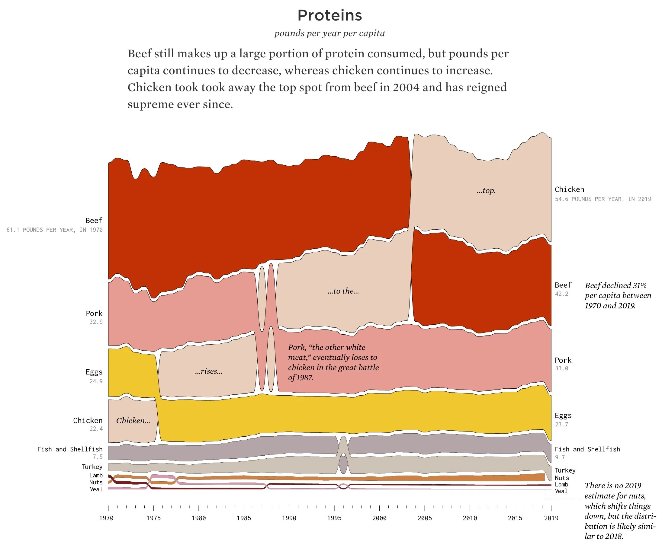
Happy_Data.jpg

“How long will chicken reign supreme? Who wins between lemon and lime? Is nonfat ice cream really ice cream? Does grapefruit ever make a comeback?”

Nathan Yau, a true treasure of the data visualization community, asks and answers these fun food questions. His visualizations are equally fun, and carefully crafted to highlight insights.

Seeing_How_Much_We_Ate_Over_the_Years___FlowingData-2.jpg

For even more examples, check out 11 More Examples of Good & Bad Datta Storytelling.


Data Insights, The Next Step in the Last Mile of Analytics

The “Last Mile of Analytics” is riddled with potholes. It is a surprisingly challenging journey to go from data analysis to influencing and changing minds. One of the biggest of potholes on this journey is the available attention of your audience. We hear the same things over and over:

My audience won’t open the report that I sent, even though I worked hard to make it easy to read.

My customers don’t take the time to sign in to our analytics tool.

I have many audiences with many different ways they want to see the data. Some want all the details; others just want to be told what is most important.

This common feedback points to a common problem: How do you deliver data in ways that people will consume it? It needs to be palatable and customized to the recipient’s desired form.

Burger King gets this with their taglines over the years:

  • “Burger King, where you're the boss!”

  • “Your Way”

  • “When you have it your way, it just tastes better.”

  • Now: “You Rule”

This was the challenge we have been considering at Juice. It isn’t enough to have a world-class platform for data storytelling. You need to reach your audience in the way they want to consume data. The more we spoke to customers, the more we heard the same thing: many people just want (1) insights or highlights delivered through (2) the channels of communication they already use.

We needed to design a fresh way to capture, annotate, and share insights so that the ultimate consumer of data got it “their way”. I’m delighted to share what we have cooked up in Juicebox.

Capturing Insights Needs to be Fun and Seamless

We wanted the capturing of insights to be an irresistible and persistent “easy button” so that the moment you had an “ah-ha!” moment, you could grab it.

In Juicebox, the capture insight button is available on all the visualizations and instantly snapshots your insight.

Insight Curators Need to Add Their Perspective

Context is King (sorry, Burger King). The person who finds an insight understands what intrigued them and often has important knowledge to overlay on the data.

In Juicebox, we provide a variety of annotation tools for pointing with arrows, scribbling, adding labels, and framing the important parts. We want people to drop their knowledge over the data visualizations like melty American cheese on a sizzling burger.

Sharing Needs to be Frictionless, and Where the Conversation Exists

Insights need to be sharable in the forms and channels where people are already having their conversations.

In Juicebox, these insights can be pasted into Slack or Teams, dropped into an email, or added to a PowerPoint presentation.

Next Up: More Capabilities for Engagement and Self-Expression

For me, the exciting part is enabling more people to use data as a way to communicate and express their expertise. Insight are about taking those special “ah-ha!” moments that we relish in our data analysis and enabling you to deliver that same bit of brilliant excitement to your audience. We have some fun ideas for helping you grab attention and draw your audience into the discussion about data.

Give it a try by scheduling a demo or requesting trial access.

Use Specific Examples to Enhance Your Data Story

I’m a long-time advocate for adding specificity into data presentation as a way to humanize your message. After all, we know that “specificity is the soul of narrative” according to John Hodgman.

Specific examples are a way to zoom in to the details while connecting your audience to the big picture ideas. I ran into a couple of great examples recently that help bring specificity to this general concept (see what I did there?):

Example 1: The Hope Summit

I recently attended a workshop put on by the Belmont Data Collaborative, part of a wider Belmont event focused on “Data-Informed Social Innovation so Regions can Thrive”. The goal was to use data to drive the discussion on health disparities in our local Nashville community. In particular, the analysis focused on hypertension as a prominent health condition in economically-disadvantaged communities.

As part of the event, we created this interactive report that lets you explore how socio-economic factors correlate with health conditions. This is data analysis as a way to highlight health disparities.

https://belmontdata.myjuicebox.io/a/hypertension_1/

But this data story was just one layer in the layer cake of presentations that brought this challenge home to the attendees. To bring specificity to the discussion, the workshop coordinator Charlie Apigian focused on a particular zip code that has been under-resourced by the city.

A powerful presentation by Katina Beard, CEO of the Mathew Walker Comprehensive Health Center that serves the local neighborhood made the problem real. We understood that the data tells only a small slice the full picture. The stories of individual people, their struggles to find time for healthy activities or gain access to healthy food options brought insight to the conversation.

It takes Data + Context + Human Connection to create understanding of a problem.

Example 2: I am Steve.

Any big idea needs to be made human-sized for it to feel relevant. Here’s a non-data example. One of my new favorite songs is I am Steve, by the group Hey Steve from the album Steve by Steve. (How can you not love their commitment to a theme?). Take a listen:

The theme of this song is universal — you don’t need to be a Steve to feel it. It speaks to existential questions: Do other people experience life in the way I do? Do we all share the same doubts and uncertainties about life decisions? Am I making the most of my life?

Those questions offer little traction outside of a philosophy class or a dorm-room hallway. Hey Steve makes it human-sized simply by framing the questions as if there are a community of Steves in the world:

“Am I only Steve with a voice in my head?”

“Go Stevie Go Stevie, be the best Stevie you can be. Run Stevie, Run Stevie, do what you can! And if it doesn’t work, just try it again.”

In this song, the Steves relate to each other as a common group. The lens has zoomed in, the connections are closer — and as a result, we are drawn in to ponder the big questions. We are all a Steve.

These are the reasons why we created a data visualization platform that makes text and images first-class elements in data storytelling. We know that you can’t bring in specific examples and human-connection only through interactive charts. We also enabled drill-down as a default because when people look at data, they almost always want to be able to zoom in to see the details that are more actionable.

Give it a try…you can do it, Steve!

The Delight of Data Insight

You know that moment when you uncover something refreshingly new in data?

It is that “wow” or “aha!” when the obvious emerges from confusion, when a messy world gives way to clarity.

These moments are not dissimilar from the flashes of insight we enjoy from stand-up comics. Check out the following short video from Bill Burr on the Conan show. In about two minutes, he drops (by my count) six comic insights that reframe how you might think about Lance Armstrong.

These delightful moments of data insight are the sweet reward in the analytics world. Whether you are a researcher, consultant, data analyst, or part-time Excel jockey, there is joy in finding something that everyone else has missed, or seeing a way to break down long-held assumptions with a new way of looking at a situation.

This is an important part of the ‘The Last Mile of Data’. For years, we’ve focused on visualizing data, creating focused, actionable data products, teaching data fluency skills, and telling data stories. But capturing, sharing, and curating data insights is the last (perhaps latest?) step in bridging the gap between data analysis and the minds of decision-makers.

Those data nuggets need to be communicated and shared in a way that your audience will latch on to them. In the video above, Bill Burr seems like he is just riffing on an idea. It is hardly so simple. He works hard on his act — from the phrasing to the segues to the facial expressions — to encapsulate the insight in an easy-to-swallow lozenge that makes the medicine taste good. The listener is willing to re-consider preconceptions because of the packaging.

This is why the role of the data analyst is challenging far beyond the need to manipulating data. You are a sociologist, salesperson, psychologist, product manager, and now…stand-up comic.

Comics are weavers of a thread that connects what we think the world is to what it actually is.

The Last Mile of Data is about going the extra step that will carry your hard work to the point of action. Creating reports and dashboards that show data paves the path to insights. There is real satisfaction in the engineering of a well-crafted dashboard. You’ve created a kind-of data playground that may spawn insights.

But don’t stop before you get to the good stuff — the delight of data insight.

A 12-Point Checklist for Public and Open Data Sites (with Examples)

Let the data run free! Government organizations, academic institutions, non-profits, and even passionate sports fans are gathering and sharing valuable data sets with the public. The topics are wide ranging, from climate change to health to inequality to happiness. It is a powerful way to support a cause and encourage data-driven analysis.

These open data sets are set loose on a website in hopes that interested visitors will come flocking. How do you make that site as effective as possible? Simply posting the data in a searchable format isn’t enough. To achieve impact, you need to make it easy to understand, manipulate, and explore.

The following checklist is a collection of best practices and reminders for your open data project.


1. State Your Purpose

To start, you need to address the question: WHY this data? And WHAT can a viewer gain from using the data? The following examples feature prominent statements about the purpose.

https://www.oecdbetterlifeindex.org/

https://blackwealthdata.org/

https://champshealth.org/


2. Segment by Audience or Topic

There are always many ways that someone could analyze and explore your data. Do them the favor of explaining HOW the data can be used. The best sites provide separate sections based on different users of the data and/or topic areas.

https://www.earthdata.nasa.gov/

https://dataunodc.un.org/

https://blackwealthdata.org/

3. Provide example insights

Naturally, you would like your visitors to find their own insights. However, they will benefit with a gentle nudge toward the types of insights that are available in your data. In the following examples, a few key insights are featured as a teaser to dive deeper into the data.

https://www.boxofficemojo.com/

https://www.nashvillehealth.org/survey/data/

https://blackwealthdata.org/

4. Let users find their own data story

Too many open data sites simply provide downloadable access to the data. This is a missed opportunity, particularly for visitors who may not have advanced analytical skills. Interactive, exploratory visualizations give your visitors a playground to find their own insights in the data. This is where the leading data storytelling platform can lend a helping hand.

https://seer.cancer.gov/statistics-network/explorer/application.html


https://www.oecdbetterlifeindex.org/

https://www.nashvillehealth.org/survey/data/

5. Encourage sharing of insights

If your site enables your visitors to find insights in the data, the natural next step is to let them share what they have found. Ideally, you’ll want the ability to capture specific visuals and share via social media.

https://www.oecdbetterlifeindex.org/

https://news.crunchbase.com/web3-startups-investors/

6. Use simple, intuitive visualizations

Keep in mind that the visitors to your data site are just coming up to speed on your data. Complex visualizations and sophisticated analysis tools are likely to overwhelm them, and cause them to bounce. You want to lower the cognitive load by finding simple and familiar ways to present the data.

https://www.nashvillehealth.org/survey/data/

https://www.movebank.org/cms/movebank-main

https://www.oecdbetterlifeindex.org

7. Include real-life examples

By its nature, data is an abstraction from reality. It summarizes and aggregates many individual data points to find trends and insights. However, this abstraction can separate your visitors from the specific things that are represented in the data. Take a moment on your site to reconnect your visitors with the actual subjects of the data.

https://data.unicef.org/

https://dmp.unodc.org/

8. Explain your metrics

For many public data sites that are focused on a particular topic, there will be a few key measures of performance. You want to ensure your visitors have a full understanding of these metrics so they can interpret the results accurately. We found many sites that do this well; others fail to provide the labeling or context to clarify what the data means.

Not so good: https://climate.esa.int/en/odp/#/dashboard

9. Explain why the data is credible

There is a lot of data out there. Why should your visitor trust what they are seeing? Take the time to explain the diligent work and research that went into gathering your data.

https://blackwealthdata.org/

10. Make the raw data accessibility for advanced users

For the novice data users, interactive visualizations are a great entry point into your data. The advanced users will have their own ideas about how they want to manipulate the data. You’ll want to give these users the ability to search your catalogue of data and download the raw data files.

https://search.earthdata.nasa.gov/

11. Provide resources to learn more

Data is great — but it is better with context. You want to include resources that give interested visitors the chance to learn more with relate research and other content.

https://www.earthdata.nasa.gov/

https://blackwealthdata.org/

12. Don’t forget the outreach and marketing

You’ve made an amazing public data website. The job’s not done. You need to make sure people know it exists. There are a lot of options: search advertising, organic search, social media, and lists of open data sources. A great starting point is to reach out to sites that relate to your topic area and make them aware of your data as a valuable resource.

Deliver more “Aha!” moments in every data presentation

What Can WordleBot Teach Us About Actionable Data Insights?

I’m a Wordle obsessive. Which is to say, every morning I find myself staring deep into my coffee in search of an elusive 5-letter word.

The New York Times (who bought the word game from software developer Josh Wardle for $3 million) knows their audience. We may be playing with words, but the analytical nature of this game is the appeal. It is a game of odds and mathematical deduction as we try to reduce the potential options available.

To appease us (and sink the hook a bit deeper), the NYT recently released WordleBot. Here’s how it describes itself:

I am WordleBot. I exist to analyze Wordles. Specifically, your Wordles.

In the next slides, I’ll examine your puzzle and tell you what, if anything, I would have done differently. Words I especially recommend are marked with my seal of approval. And, if you’re curious, I’ll show you the math behind my recommendations.

Below is an example of what WordleBot shows about a game (I chose a particularly lucky game for me).

WordleBot delivers data insights in a particularly clever way. Rather than guiding you to an answer (I built a data app for that — and it immediately sucked the fun out), it takes a different tact. It guides by teaching. Let’s see how:

There is so much good data communication here:

  1. WordleBot teaches me how to think about my Wordle performance by defining different measures that impact success. Getting to the answer is a combination of Skill and Luck with the goal of reducing the number of potential Solutions Remaining.

  2. In straightforward language, it describes my performance on the first guess.

  3. Rather than telling me what I should have done, it provides alternative options and explains how the outcome could have been different. I can play out different scenarios.

After stepping through the series of guesses, WordleBot summarizes my choices compared to the optimal, data-driven choices.

This is a non-traditional way of sharing data insights — and something worth learning from. If you approached delivering data insights like WordleBot, you would focus less on telling people what they should do or, worse, what they should have done. Instead, you would ask yourself, how can I teach by showing different decisions and explain the resulting outcomes?

In other words, show how to think, not just what to think. In this way, the role of data in informing decisions will become evident through the evidence.


Brace your audience for impact. Get started with Juicebox


15 Lessons from the Data Story Creative Process

What do you get when you put a Data Scientist and a Data Storyteller in a room full of executives for two days?

Sorry, no punchline…this is serious. The answer is The Data Story Creative Process (DSCP) workshop — a hands-on, case study-based learning event that teaches a framework for using data to drive informed action.

We played with data, explored insights, structured stories, and discussed the barriers to reaching our audience. Here is a tasting menu of the lessons we shared:

A repeatable process

Every data project is unique. Yet our methodology applies common steps and best practices to bring discipline and focus. The DSCP is a more thoughtful approach to solving tough problems with data.

Hands-on learning with real data.

We learned a lot from our workshop. Lesson 1A: People like to get their hands into data in a realistic scenario to apply the concepts and skills we are teaching.

Find your data story

Your data story exists at the intersection of your goals, your audience’s priorities and levers, and the impactful data insights you are able to find.

This is one of many places where we emphasize the need for focus.

Visualize for readability and shared meaning

When it comes to visualizing your data, you have two primary objectives:

Readability: How do you minimize your audience's effort to understand the visualization?

Shared Meaning: Does the visualization support and emphasize your insight?

Guide your audience to actions

Actionable insights should be the goal of your story, even if that action is a need to gather more data. We discussed the characteristics of a data-driven action and the frustrations of presenting insights that can’t be acted upon.

The goals is to change the mind of your audience

Working with data is a matter of mindset as much as skillset. Most importantly, you want to understand the needs of your audience so you can tell a story that changes their perspective.

Where are you in the movie?

Charlie shared a fantastic analogy for considering how to analyze data. You want to think of the data as if you are at a particular scene in a movie. You can look back to understand what got you to that particular point. Then you can use models to predict where the story is going to end up.

Data is a team sport

Our workshop discussion underscored our belief that data is a team sport. You need different players — the analyst, the subject matter expert, the decision-maker — to work together from the beginning to chart out a successful path.

Preparing your data

Preparing your data is the hard work that needs to be done before the fun begins.

For our executive audience, we wanted them to appreciate the potential complexity and effort that data preparation can require.

Demystified data terminology

There are a lot of data buzzwords and abbreviations flying around: AI, ML, lakehouse, data engineering, storytelling. We took some hot-air out of these terms and discussed what they really mean.

Different sources of insights

Finding data insights is part of the “Play” stage in our process. And there are many tools and techniques to reveal those insight. We want to combine both data-led insights (e.g. modeling) with exploration that is guided by human understanding of the problem.

Kill your darling data insights

Analytical play-time is great, but at some point you need to evaluate and extract the most valuable and actionable nuggets. We provided an approach for sifting through insights to find those that are “story-worthy.”

Structure a data story

Data storytelling uses the patterns and expectations of traditional narratives to grab and keep the attention of your audience. We can use the classic three-act play structure to set-up and deliver on inherent story expectations.

The (Short) Attention Economy

With our full inbox and onslaught of text messages, it is hard to grab and keep the attention of your audience. We shared techniques that can help your data story stick: be unexpected, connect to emotions, be specific, and be relatable.

Advocate for your data products

Our workshop was about defining a problem to be solved with data and creating the data story that will lead to action. We closed with a final message: you need to step up to advocate for your results. Think of your dashboard, report, or analysis as a product, one that needs to be marketed and sold for people to get the value.


How Data Storytelling Can Build Better Customer Connections

“Like a good neighbor, State Farm is there.”

The State Farm tagline — like so many advertisements — does more than connect with new customers. It also wants to convince existing customers that they made the right decision in choosing State Farm for their insurance.

The same is true about delivering data to your customers. Reporting is more than a feature of your product, it is an opportunity to remind customers of the value your solution provides.

Some product companies understand this concept well. For example, Spotify’s Wrapped is an annual report sent to listeners to summarized their music habits. It is a delightful journey through personalized data and a reminder of how much you have enjoyed the service throughout the year.

Spotify is more the exception than the rule. Here’s a more typical example of reporting, courtesy of Hubspot:

Hubspot reports are literally the very last thing (last drop down, last item) you can find in the Hubspot UI.

But what if Hubspot’s reporting had more ambitious goals than a simple data access interface? What if it defined the pressing questions that many users should care about, and drew a direct line to answers?

A better form of reporting wouldn’t necessarily require different data as much as a user-oriented mindset. It would combine utility with a story that reinforces the value of the product. We are getting closer to “data storytelling” when we use data to convey insights and a message. My definition of data storytelling is:

The presentation of data to communicate a message using the techniques of traditional narrative forms.

How customer reporting can make a difference for your product

Customer reporting is an under-utilized tool for product leaders. Let’s examine the ways that it can build customer relationships:

1. Establish a language

You are the expert on your product and the data it captures. What metrics are you going to emphasize? What behaviors do you want to encourage? Reporting is your opportunity answer these key questions and define what matters.

Twitter is encouraging activity by making their first reported measure ‘number of Tweets.’

2. More touch-points, more better

Staying top-of-mind is critical for product success. Reporting is a chance to deliver a high-value piece of information to your customers — and remind them you exist.

FullStory delivers a weekly digest to my inbox that reminds me to check our engagement numbers.

3. Differentiate your solution

You will set your product apart from the competition when you make your data a valuable part of your solution.

Lunas Consulting (Sales as a Service) recognizes that reporting on the sales activity and wins is a critical part of their client value. They have designed a Juicebox report that provides an interactive exploration of weekly and historical results.

4. Understand the value drivers of your business

One of the under-appreciated elements of reporting is that it requires you to evaluate what activity is important (and what is not). You have to understand where your customers get value. This understanding can then impact your product development decisions. You will understand the drivers of your business better than ever.

Frameworks like the “North Star Metric” force a product organization to understand the key measures of customer value. You want to consider how your product success aligns with the value your customer sees, and how that is displayed in reporting.

https://amplitude.com/blog/product-north-star-metric

Reporting requires managing a careful balance of conveying a message about your value with the transparency and hard-reality of data.


How data storytelling can help

Traditional reporting is not great at connecting with non-analytical audiences. It tends to come in one of two forms: 1) The one-page dashboard that tries to compress as much data as possible into a small space; 2) The raw data table that makes no attempt to presenting the data in a way that might reveal insights.

Densely packed dashboard

Tables of data

In contrast, a data storytelling approach takes responsibility for communicating and engaging the audience. How?

It’s not about you, it’s about them.

You need to start with your audience in mind. The audience is the people who are going to do something with your insights and analysis. If you want them to change their behavior or decisions, you need to understand their motivations. What are their priorities? How do they best absorb data? What actions can they take?

In my recent presentation entitled ‘The Star Trek Guide to Better Analytics’, I found Dr. Bones McCoy to be a good characterization of your audience: he’s not an engineer (or data-savvy), he’s skeptical, and he’s people-oriented. But every audience is different. Check out our Data Personality Profile for a framework for evaluating your audience.

Data Storytelling is Writing

I hate to take you back to your writing classes but data storytelling isn’t just a collection of data visualizations, it is a form of writing. You are building a narrative that makes an argument.

Your narrative structure should start by posing the problem and context, followed by your analysis, and finally your conclusion. In a data story, we like to use the three-act story structure.

Be Simple and Specific

When you are presenting data to your audience, your priority is to make it easy to understand and easy to connect to.

Simple to understand means using charts and visualizations that are intuitive and well-understood. I love an exploratory treemap or network diagram or Sankey chart. But each of these advanced visualizations requires your audience to learn how to read them. We’ve found that it is far better to stick to charts that have a lower “barrier to entry.”

 
Whatever it is, the way you tell your story online can make all the difference.
— Quote Source

You also want to explain the data and insights in ways that connect emotionally or logically. Often this means providing specific examples. After all, “specificity is the soul of narrative.” In addition, you want to look for ways to make your data relatable.

One of the all-time best specificity examples is the Gun Deaths visualization created by Periscope.

Package for consumption

Finally, how your data story gets delivered really matters. A lot. Some people want the ability to interactively dig into the details. Others just want the key message, and to have it delivered to their inbox. 

  • What is the delivery method that will most likely grab your audience’s attention?

  • How much explanation and in-person hand-holding is necessary?

  • Is the data story a collaboration or a one-way broadcast?

Beyond the delivery method, we have also found that the visual design of your data story is important. If you’re not a designer, how do you make something that looks beautiful, clean, and clear? Start by removing the ‘chart junk’, all the visual elements that distract from the data. Then consider whether you’ve used color carefully, made smart font choices, and used layout to guide the reader.

Where to get started

Those are some of the basic concepts that will get you started toward presenting data as a compelling story. Of course, there is a ton more to learn. That’s why we’ve been creating learning content that we hope will teach a new generation of data storytellers. Here’s where I’d recommend you go next:

  1. Learning from the best with 20 outstanding data storytelling examples

  2. Dive deeper with our Complete Guide to Data Storytelling

  3. Practice your skills with the only build-it-yourself data storytelling platform.


A Hierarchy of Needs to Live Your Best #DataLife

Maslow’s Hierarchy of Human Needs provides a useful framework for understanding the drivers of behaviors. He recognized that basic needs must be met before higher level functions can happen. He also identified that once a need is met, it becomes an expectation.

Plateresca / Getty Images

Can we apply a similar framework to our life with data?

I’m far from the first person to ask this question. However, the data-oriented “Hierarchies of Need” tend to focus on the needs and capabilities of the organization. Here are a couple of examples:

https://medium.com/@hugh_data_science/the-pyramid-of-data-needs-and-why-it-matters-for-your-career-b0f695c13f11

As is so common in the analytics space, the focus is on technology and capabilities. If you are the CDO or CTO, this may provide a useful roadmap. It is less so if you are a data analyst, operations manager, or student learning how to work with data.

We’ve always been more interested in the human side of data. What do people need? What are the pains and concerns when it comes to using data? That’s why we are hell-bent on making the most human-friendly creative tool for expressing with data.

This is where my “DataLife Hierarchy of Needs” fits in — it highlights the ascending needs for an individual to make use of data. We’ve talked to hundreds of people who are using data in their jobs. Similar themes come up again and again, and this structure helps explain where people get stuck.

A quick tour of the levels:

Level 1: Physiological needs, i.e. get the data

Nothing happens if you can’t get your hands on the data. And once you have the data, you need to make sure it is accurate, understood, cleaned, and structured for analysis. Like the basic needs for food and shelter, this is the place where the under-served and under-resourced people run into a barrier. The challenge of not knowing how to define data requirements is sometimes enough halt any movement up the pyramid of needs.


Level 2: Safety needs, i.e. the confidence to work with data

Long before anyone can express themselves with data, they need to develop foundational data analysis skills. These skills include: combining data sources, being able to define important metrics, and choosing the right charts to explore and express data.

Without this sense of confidence, they won’t feel safe moving forward into finding and sharing insights in a social environment.


Level 3: Love and belonging needs, i.e. engaging with the broader organization

The work of data exists in a social environment. The next step up the pyramid is when we understand how our use of data starts to impact the people around us. This is where we expand outside ourselves to start to consider the audience, the priorities of the organization, and how to best visualize data for understanding.

Social and communication skills become increasingly important as we move to higher level needs. It was 15 years ago (!) that I wrote that the problem of analytics “isn’t a technical problem, it’s a social problem.”


Level 4: Esteem, i.e. pursuing recognition for the data insights

At last, it is time to become a data author, a creator of data products. With the skills and data access, you can look for ways to express your insights through data stories, design repeatable reports, and manage who gets access to the data and how they receive it. The social capabilities from the previous level gives you direction to know what you should create from data.


Level 5: Actualization, i.e. achieving action from the data

Ultimately, the goal of using data is to guide informed actions. If your insights are effectively communicated, you have the opportunity to change minds. But you will face resistance from people who have pre-existing assumptions or incentives to push back on the results you share. Perhaps this last level is the hardest of all because it takes subtly and skill to influence others to change how they view their world.

Download a PDF version of the Data Life Hierarchy of Needs.

The Power of Story: 6 Lessons from a Master Storyteller

I had the pleasure of attending a presentation by Rick Rekedal at Belmont University. The former Chief Creative of the Global Franchise Group at DreamWorks Animation spoke about ‘The Power of Story’ using examples from his work on the How To Train Your Dragon movie franchise. His lessons are as relevant for a data storyteller as they are for an aspiring screenwriter.

Here 6 storytelling lessons from Rekedal — and the implications for your next data story:

  1. Story starts with your empathy for your audience. People want to love how they feel after hearing the your story. On the other side of that coin: your audience has fears and a story can help release them from those fears. Action: Determine what your audience wants to feel from your data story. Are they looking for confidence in in a decision they are making? The thrill of finding a new opportunity? Analytical support for a problem they believe is important?

  2. We are living in a “story economy.” We have a growing array of platforms for sharing stories, and people want to feel purpose and belonging. Therefore, your story needs to stand out in a crowded, noisy field. The best way to stand out is by knowing the heart of your audience. Action: Analyze what stories the audience already has heard. Determine how your data story is going to fit in, or stand out.

  3. Stories are about enabling change. Stories have the power to transform how people feel, see themselves, and act. They can also reinforce and build on beliefs that people already hold. Action: Before you start authoring your story, have a clear definition of what change you want to bring about in your audience.

  4. Preparation is the majority of the work. Two-thirds of the effort of storytelling should be put into understanding your audience, their needs, and the landscape of stories. Only then does the crafting of your story begin. Action: In the data world, deadlines can pressure us to race to the finish line. Step back. Do you know enough about where you are going before you dive into the analysis?

  5. Stories bring clarity to difficult concepts. The best stories help give audience a language about something they struggle to express. The process of editing your story is crucial to ensure clarity and precision of ideas and language. Action: Edit your data story down to the core concepts — and articulate them with care. It is ok to cut some interesting information if it bring focus to the most important concepts.

  6. Find your central theme. Of all the elements of a story that Rekedal enumerated (plot, character, thought, speech, melody, decor, spectacle), the “thought” — i.e. the central theme and message — is most important. This is about finding the heart of the story. Themes should be important and reach deep into the psyche of the audience. His examples included: “I can accept myself in my own skin”; “Unconditional friends let me share my true colors.Action: Each data story should have one theme. Don’t try to do too much. Make more stories.