The Art of Data Storytelling
Data Storytelling is a powerful way to present data in ways that influence your audience. It is a skill that combines elements of artistic expression and structured methods. In this article, we will start by learning from the mindset of a leading storytelling organization, Pixar. Then we will discuss how to structure data stories to guide your audience through data.
Part 1: Lessons in Data Storytelling from Pixar
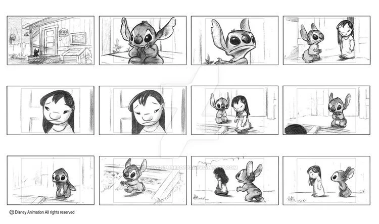
Pixar is the gold standard in storytelling. With their 17 feature films, they’ve redefined how to create animated worlds and compelling characters.
What if you could know the secrets of Pixar’s storytelling success? Now you can. Pixar announced recently that they would team up with Khan Academy to deliver free lessons on how they deliver storytelling magic.
We’re long-time fans of Pixar at Juice because their methods don’t just apply to good storytelling, but to good data storytelling as well.
Pixar’s lessons offer some great principles that can be used to improve the narratives you create with your data. We’ve pulled out some of the best tips that can be applied to data storytelling:
1. On Asking the “What If” Question
Although our movies involve hundreds of people and take years to make, they all begin with a simple idea about some world and character. What if there’s life out there in the universe? What if a rat wanted to cook haute cuisine? What if our toys that are all around us actually were sentient and can come alive? These what-if questions invite the imagination into a story we want to explore.
“The best ‘what ifs’ are questions that sort of feel like a key that unlocks the door.”
Asking “what if” is a great question to ask yourself when you’re first deciding what direction you want to take your narrative. Not only does asking this question guide how you structure your story, but it also allows you to determine what information is most important to your audience and what can be left on the cutting room floor. It can be easy to overwhelm with data; narrowing your focus is the greatest favor you can offer your audience.
Here are some “What If” questions you could apply to your data storytelling:
What If my sales team knew exactly which prospects needed the most attention today?
What If nurses could tell which patients were at risk for sepsis?
What If human resources leaders could explore the complexity of their organization in the same way they explore Google maps, zooming out to see how all the parts connect and zooming in to see what’s going on on the ground?
What If teachers could visually see how each of their students was doing on their learning journey, and quickly identify the knowledge gaps and resources to fill those gaps?
2. On World
A ‘what if’ statement is ultimately connected to a world and a character… When we say ‘rule’ what we really mean is the environment or set of rules in which our story will take place.
Choosing your world can be most closely associated with the effort to set the context in our data stories. It’s important to ground the audience in the “world” before you start introducing the “characters” - your data. In our data apps, we are careful to set the stage for the audience by explaining the purpose and context before thrusting users into a series of charts.
3. On Flawed Characters
Entertaining characters are often deeply flawed...these flaws can also be the key to why audiences care about them.
This lesson reminds us of “flawed” data points. Often the outliers and the unexpected data points are the most interesting. Sure they don’t tell the whole story, but they definitely give more insight into what’s actually happening with your data and can provide some colorful detail in your data story.
4. On Fully-Developed Characters
We call these characters fully developed. This means we’ve gotten to know them so well that we can imagine them in almost any situation.
Providing full context around the characters in your data allows you to be able to look at your data points from multiple perspectives and draw out three-dimensional insights, an important step in data storytelling.
5. On Behavioral Characteristics
We can talk about characters in two ways. They have external features, which are their design, their clothes, what they look like. Then much more interesting is the internal features. Are they insecure, are they brave, are they jealous?
With this lesson, the distinction between descriptive and behavioral data comes to mind. For example, we can look at descriptive data about customers, but really the behavioral data is much more interesting. How do customers react to stimuli? That’s where the real story is.
6. On Authentic Experiences
Characters have to come from authentic human emotions and experiences.
When working constantly with numbers, it’s easy to sometimes forget that behind each data point is a living, breathing person. How do you connect the data to the actual real-life actions that are taking place to create that data? One of the best ways to do this is by bringing specific examples into your data story. As John Hodgman likes to say: “Specificity is the soul of narrative.”
We created a complete lesson in our Data Storytelling curriculum about making data relatable and specific to help connect to your audience.
7. On Story Flow
What happens when I tell the story to another person, is that these other things show up, without me asking for them, even while I’m telling them. The story starts to come alive. The characters start to come alive. And then also the person you told the story to will tell you what they thought of it, notes, they’re free. They actually are helping you make your story and characters better.
This is very true of data storytelling. The more you run through the story flow with users, the more insight you receive into how they think about the data they are seeing and what they need to know. Based on this feedback, you can adapt and change the way you present your data to make a better overall experience for your users.
These lessons from Pixar give us some of the mindset it takes to tell a data story. Now, let’s look at the structure that provides a strong architecture for your data story.
Part 2: Data Story Structure
While traditional storytelling and data storytelling are not identical mediums, there is quite a bit of overlap between the two, and many of the best practices for one can be applied to the other. Take for example the idea of structure when it comes to storytelling. Structure, or in simpler terms, “what do you want the audience to know, and when?” is hugely important when it comes to the practice of data storytelling.
It may seem counterintuitive to consider modeling your data presentations after traditional storytelling structure. After all, storytelling is an inherently subjective act. The storyteller is crafting something that helps the audience learn about a theme that the storyteller finds important, and consequently a moral that should be learned. Applying this to data can seem like enemy territory for analysts who feel that their job in presenting data is to “let the data tell the story.” It’s important to note, however, that the data doesn’t have an opinion on what is important. For example, I was speaking to an HR Analytics team recently and it was clear to me that they wanted to use data to share important lessons with the business. It was less clear that they felt empowered to do so because they felt the data should speak for itself. Data often needs a voice to give it meaning.
When creating the structure of your data stories, keep in mind that it often takes a while to get to the structure that works best for what you are trying to accomplish. That is why it is important to create something ‒ even in a rough form ‒ and get it in front of people who will give you feedback. Does it resonate and connect with the audience ‒ or is it more like the unpopular original structure of Finding Nemo? Without this knowledge, you’re more lost than Dory and Marlin ever were.
Dive deeper into a lesson on story structure from our collection of Data Storytelling Lessons.
Story Beats & Story Spine
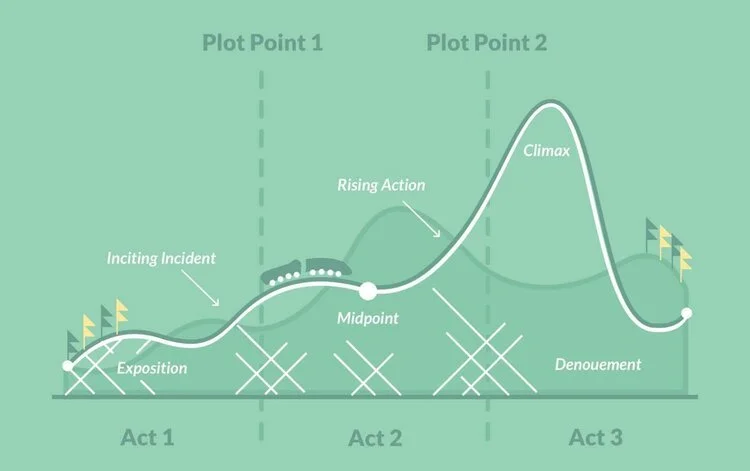
An effective way of organizing story structure is by utilizing story beats, the most important moments in your story, and story spine, a pattern into which most stories can fit. While your data story most likely won’t open with “once upon a time…” and end with “and ever since then…” the lesson can still be applied. Using a structure that is broadly familiar to audiences and hitting familiar story beats will help ensure that a data story leverages the hooks that storytelling already has in people.
Image courtesy of Reedsy Blog
Your audience is looking for certain things in a data story, just like they would in a Pixar film. Who or what are the key players? What’s the conflict? How can it be resolved? Utilizing these when appropriate will make your data stories much more effective. The traditional 3-part play provides a template for designing data stories.
Act 1
The first act of a film serves to introduce the audience to a protagonist, establish the setting, provide information into how the characters’ world works, and introduce an obstacle that sets the rest of the story in motion.
In traditional dashboards and reports, this information is often missing and leads to users not knowing where to start. If your audience is going to go on a data adventure with you, they should start off by caring about the situation that exists. Data stories should start with a high-level summary that then lets users progressively and logically drill into more complex details and context.
Act 2
Pixar states that the second act of a story as “a series of progressive complications.” My favorite way of describing act two is “the part of the story in which you throw rocks at your characters.” Either way, what happens in the next part of your data story is clear: addressing conflict.
When it comes to data stories, act two is the back-and-forth exploration of the problem. In the traditional story spine, they refer to it as “because of that…”; for analytics, we call it “slicing-and-dicing.” Throughout act two of your data story, you are showing your audience the drivers of problems and identify any outliers.
Act 3
In traditional storytelling, the third act is the part of the story where the main character learns what she truly needs — as opposed to what she thought she wanted. The character has gone on a transformation along the course of the story, and that is evidenced in the final act.
This is much harder to pull off in data storytelling. In data storytelling, I believe the protagonist is the audience. Much like the main character, the audience needs to be transformed and understand something new and important. A satisfying story is when a problem is fixed and the world is set right in some way. Great data stories deliver that change -- but to do so they need to do more than change the audience’s perspective. They need to make the audience act on, not just discuss, this transformation.
Work Backward
The best bit of advice from the Pixar storytellers is simple: work backward. This is how we do it at Juice: we consider what is the endpoint, the change or impact that we want to make on the audience, and then craft the story that can help get us there.


