
A Dashboard Alerts Checklist
The tendency with reporting, and information dashboard design in particular, is to cram as much information on the page as possible.
We offer tools to make data presentation as clear as possible (Juicebox, chart chooser). Sometimes clean isn’t enough; a more dramatic approach is needed.
A Guide to Building Better Data Products
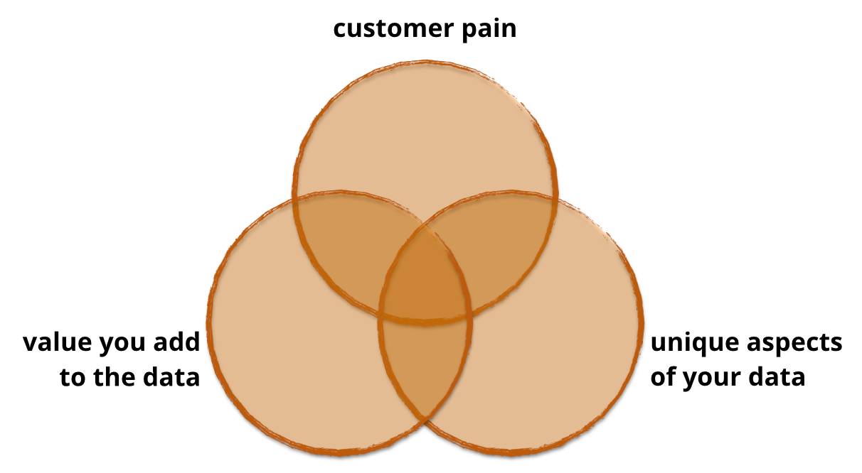
At Juice, we’ve helped our clients launch dozens of data products that generate new revenue streams, differentiate their solutions in the market and build stronger customer relationships. Along the way, we’ve learned a lot about what works and doesn’t. In this series I’ll take you through what you need to know to design, build, launch, sell and support a data product.
How to Create a Successful Real-time Dashboard
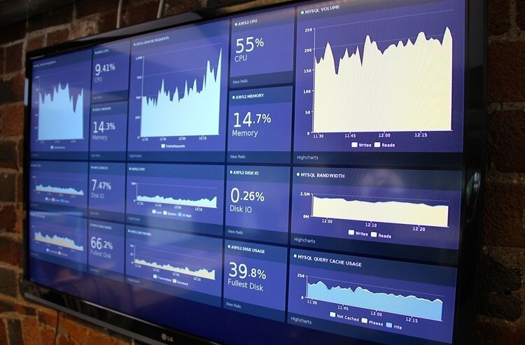
Real-time dashboards provide a single view to the most important performance metrics for an organization. Data exploration takes a back-seat to a focus on monitoring trends and progress to goals. Real-time dashboards show up on big screens in call centers, monitors in marketing departments, or the desk of a fictitious Private Equity titan on the TV show ‘Billions’.
Better Know a Visualization: Understanding Parallel Coordinates Charts
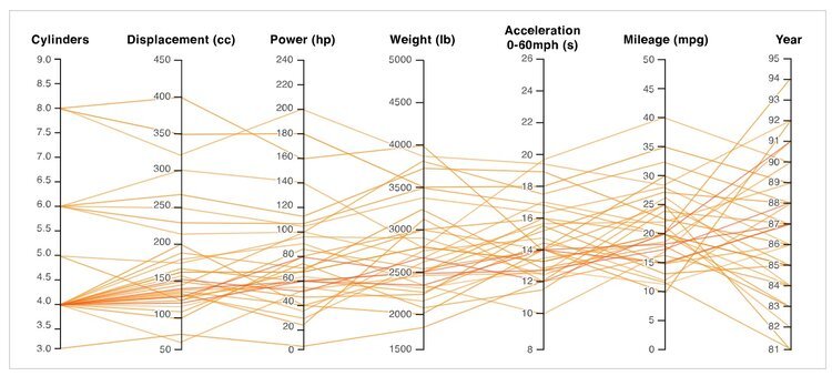
Parallel coordinates is a visualization technique used to plot individual data elements across many performance measures. Each of the measures corresponds to a vertical axis and each data element is displayed as a series of connected points along the measure/axes.
10 Ways to Improve Your Data Visualizations
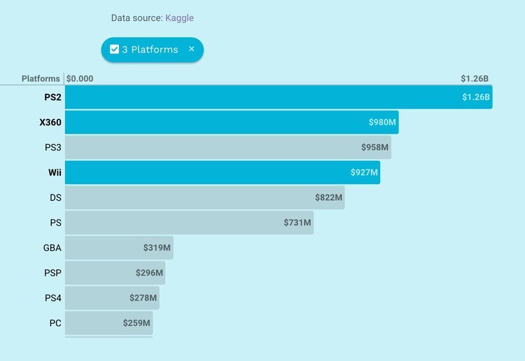
Less is often more when designing your data visualizations. Here are ten lessons we've learned about how to better communicate with data. The key: give readers less information to absorb.
5 Rules for Successful Success Metrics
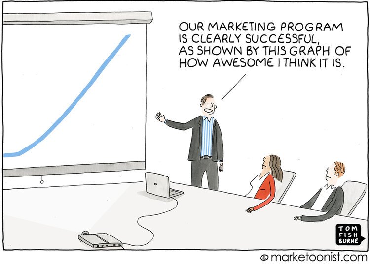
Here’s an analytics truism: everyone wants a dashboard (a.k.a. key performance indicators (a.k.a KPIs), success metrics, scorecards). Managers want a barometer of performance, a hammer to use on their subordinates, and a straightforward quantification of their business. Below are a few of the guidelines we use when we take on this task:
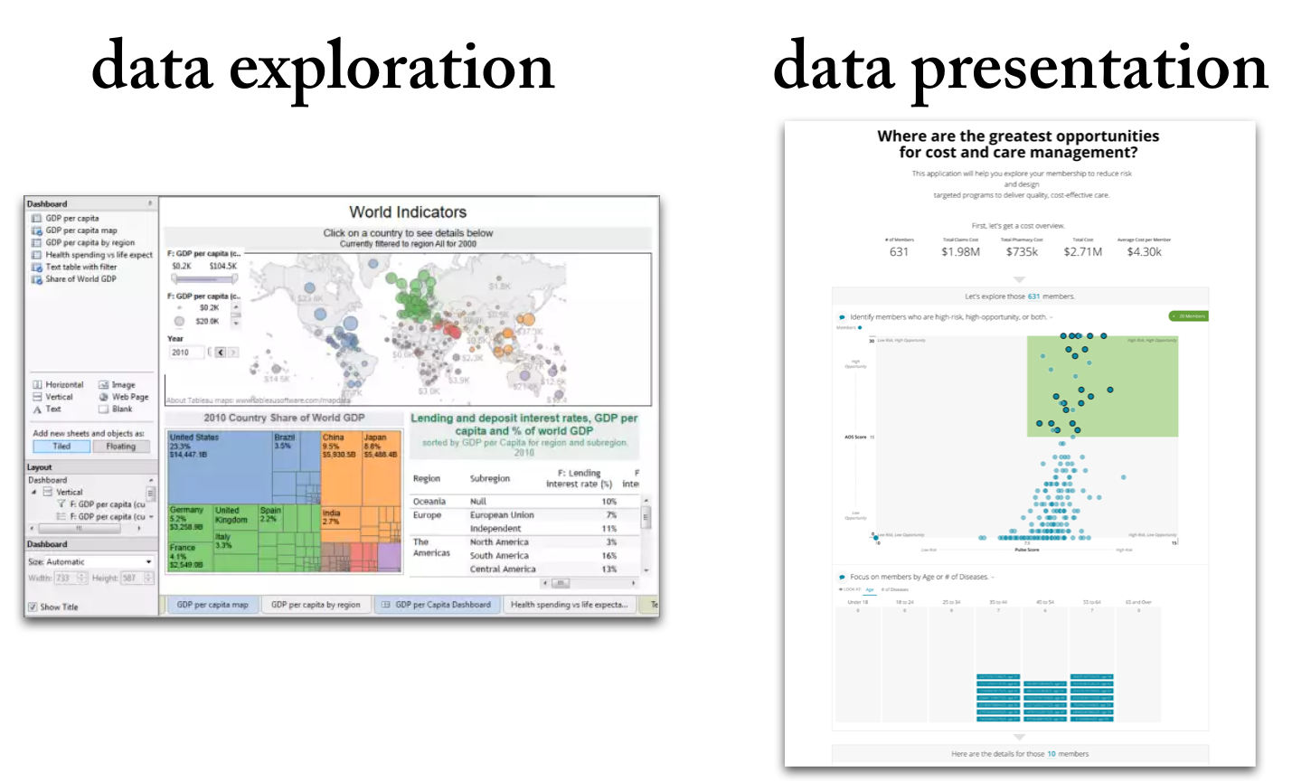
6 Differences Between data Exploration and Data Presentation
Data exploration means the deep-dive analysis of data in search of new insights.
Data presentation means the delivery of data insights to an audience in a form that makes clear the implications.
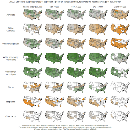
Better Know a Visualization: Small Multiples
(With enough visualization methods to warrant a periodic table, it can be confusing to know what to use and when—and which visualizations are even worth considering at all. This series of posts is intended to introduce you to the visualization approaches that we find most useful, practical, and audience-friendly.)
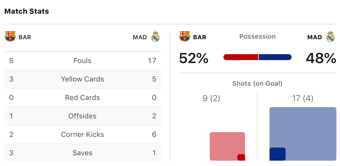
"If you are explaining, you are losing"
The title comes from Ronald Reagan, sometimes known as “The Great Communicator.” If he knew anything, he knew that simplicity was foundational when reaching a broad audience.
That doesn’t stop people from finding ways to overcomplicate their data visualizations. Take this example from The Data Viz Catalogue. It is called a Radial Bar Chart.

How do you build a high-impact analytics team? Jamie’s team knows.
It all begins with an idea.
Data Storytelling 2.0
It all begins with an idea.
The (Unfinished) Data Story
It all begins with an idea.
9 Lessons on Data Products
It all begins with an idea.

Getting Data Product Requirements Right
Often customer data products or applications go awry because of poor requirements. While customers can describe a billing workflow or a mobile app feature, explaining how data should be used is less clear. Merely documenting a wish list of reports, fields and filters is a recipe for low adoption and canceled subscriptions.
10 Differences between Customer Reporting and Data Products
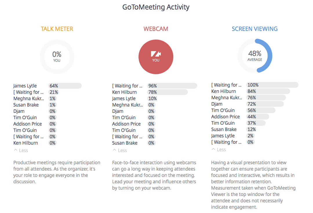
We’ve been talking a lot about how innovative companies are realizing the need to enhance their solutions with more customer-facing data products. For example, GoToMeeting launched a new feature called “Insights” where they send you engagement summary information from your meetings. Here is one from a recent Juice Lunch & Learn:

Reports vs. Presentations: A Tale of Two Data Sources
Have you ever thought about why you deliver a presentation versus sending a report? Let’s face it – reports are easier. They don’t require coordinating schedules or reserving meeting spaces and preparing information for reports is far less labor intensive than pulling together the content required for a quality presentation.
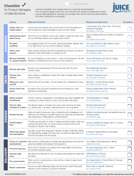
A Checklist for Creating Data Products
“Data is the new oil.”
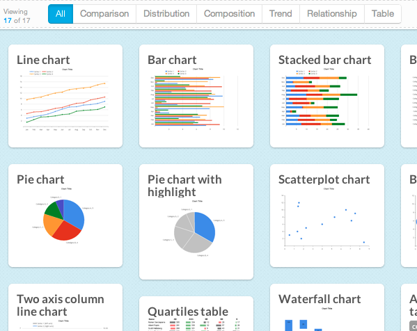
Introducing Chart Chooser -- V2!

Breaking Free of the One-Page Dashboard Rule
Conventional wisdom says that an executive dashboard must fit on a single page or screen. The argument hinges on a pair of assertions about this constraint: it provides necessary discipline to focus on only the most critical information; and it enables the audience to see results "at a glance."
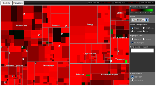
10 Lessons in Treemap Design
In the information visualization world, treemaps are on the rise…and justifiably so. Treemaps simultaneously show the big picture, comparisons of related items, and allow easy navigation to the details.
