
Tips for Using Photos in Data Storytelling
Data storytelling needs more than a collection of data visualizations. It is about weaving an engaging message that combines data exploration with narrative, descriptions, and graphics. Photographs, in particular, can play a vital role to help your data story grab attention and provide emotional engagement.
Photos have always been an important element that we integrate into our data storytelling designs. Here’s why:
Photos can underscore a theme or message;
Photos can bring an element of humanity and emotion to a data story;
Photos provide some visual space between information-dense charts and text;
Photos can be used to attract and guide the attention of your audience. People will be instantly drawn to the photos first.
Now we’ve made it trivially easy for you to add photos to your data stories in Juicebox.
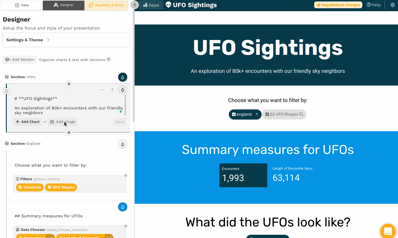
We’ve integrated into Unsplash, which has over 2 million photos and includes a license that allows for free and commercial use of the photos (though you may not sell them). You can also upload your own images when you want to add company logos, product images, or a picture of a happy customer.
How should you think about picking photos to include in your data story? Here are the most important do’s and don’ts:
Balance the colors
👎 You don't want the colors in your photo to compete with the colors used in the rest of your data story. A vivid photo will leave your reader wondering where to place their attention.
👍You want the colors of your photos to complement the primary color of your data story. If the content is largely white/black/grey, a photo with bright colors will bring energy. If you are already using bold colors, find a photo that shares the color scheme or is in black & white.

Purples and greens aren’t good friends. Consult your color wheel.

Connecting colors in the photo to other colors in your design
Match the theme or mood
👍The photo should align with the overall message of your data story. Is your theme dark, hopeful, energetic, serious? The right photo will help you set the tone you are looking for.
👎 You want to avoid dissonance between the story theme and the images. A serious topic is not well suited to a silly image. A data story about people should include photos of people rather than machines or abstract concepts.

A spooky picture to go with the UFO theme.

Hooray, the kangaroos are excited about your key metrics!
Avoid on-the-nose-ness
👎 Avoid using photos that literally present the subject of your data story. The photos are more likely to receive groans from your audience as they realize what you've done. They are the "Dad Jokes" of design.
👍The best photos will alude to your message or theme without being overly literal. To do so, the photos might pick out a specific example or, on the other hand, express broad feelings or concepts that are relevant to your data story.

A discussion about architecting your story

Get it?! Story + Structure.
Avoid stock photos
👎We’re all tired of the unnaturally happy business people sitting at a conference table. Or the close up image of shaking hands. This is one reason we value our integration with Unsplash, which provides photos by photographers with a specific eye for authentic details.
👍You want to look for photos that bring a sense of authenticity or reality to your data story. Better to find an image of a specific location, product, customer, or activity -- rather than something that feels generic.

Show the top paid athletes

A generic “athlete”
Abstraction vs. Detail
👎If you are showing a lot of data, a detailed photo may distract the reader from the content you want to be the focus of your message. On the other hand, add a detailed photo -- and give it some visual space -- if you want the reader to linger on the image.
👍There is a place for abstract photos (when you are setting a mood or feeling) and detailed photos (when you want to show something important for your readers). Consider what the story needs to enhance your message.

A photo that suggests zooming-in

A complex visualization competes for attention with a crowd of people.